design
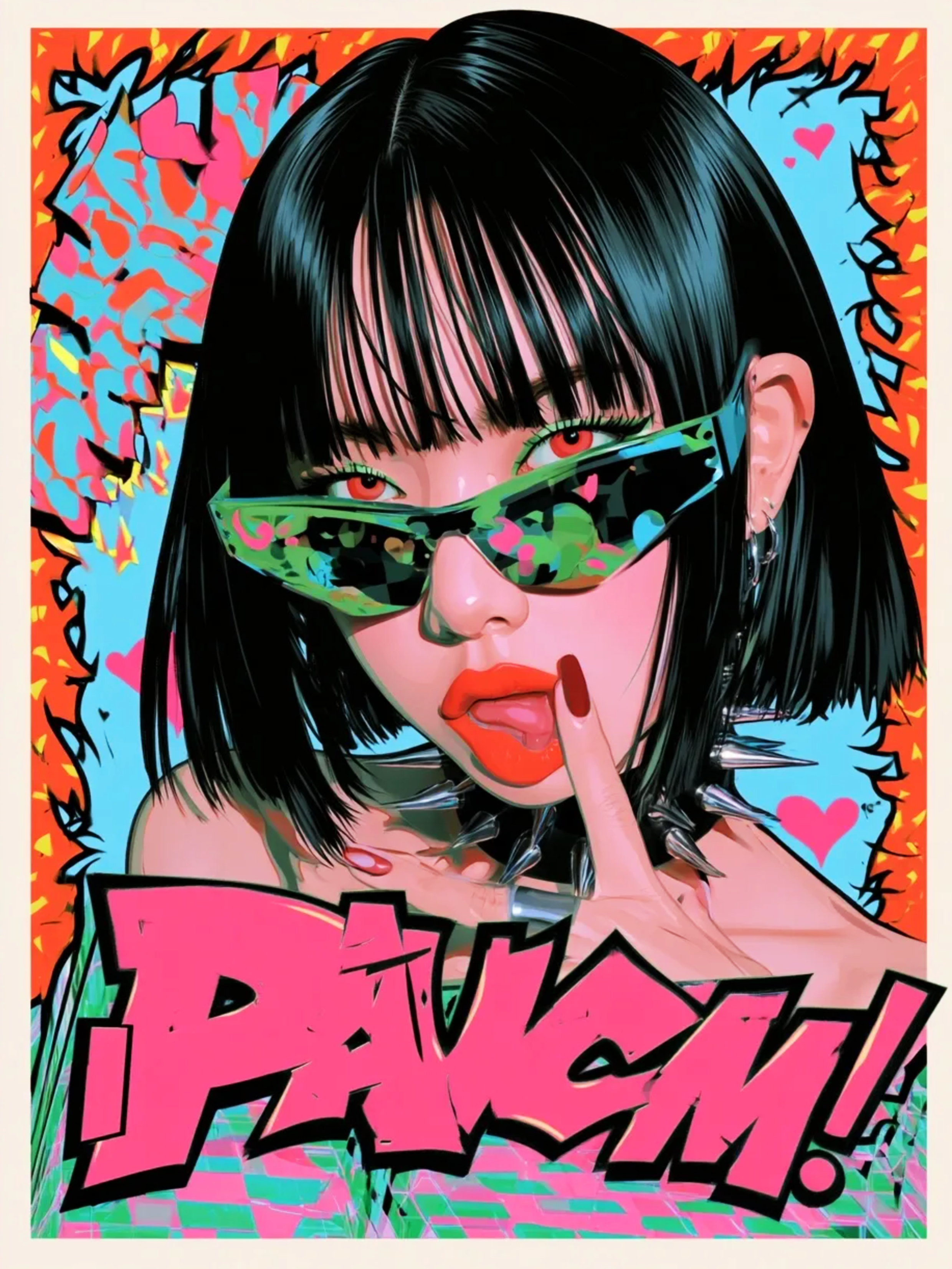
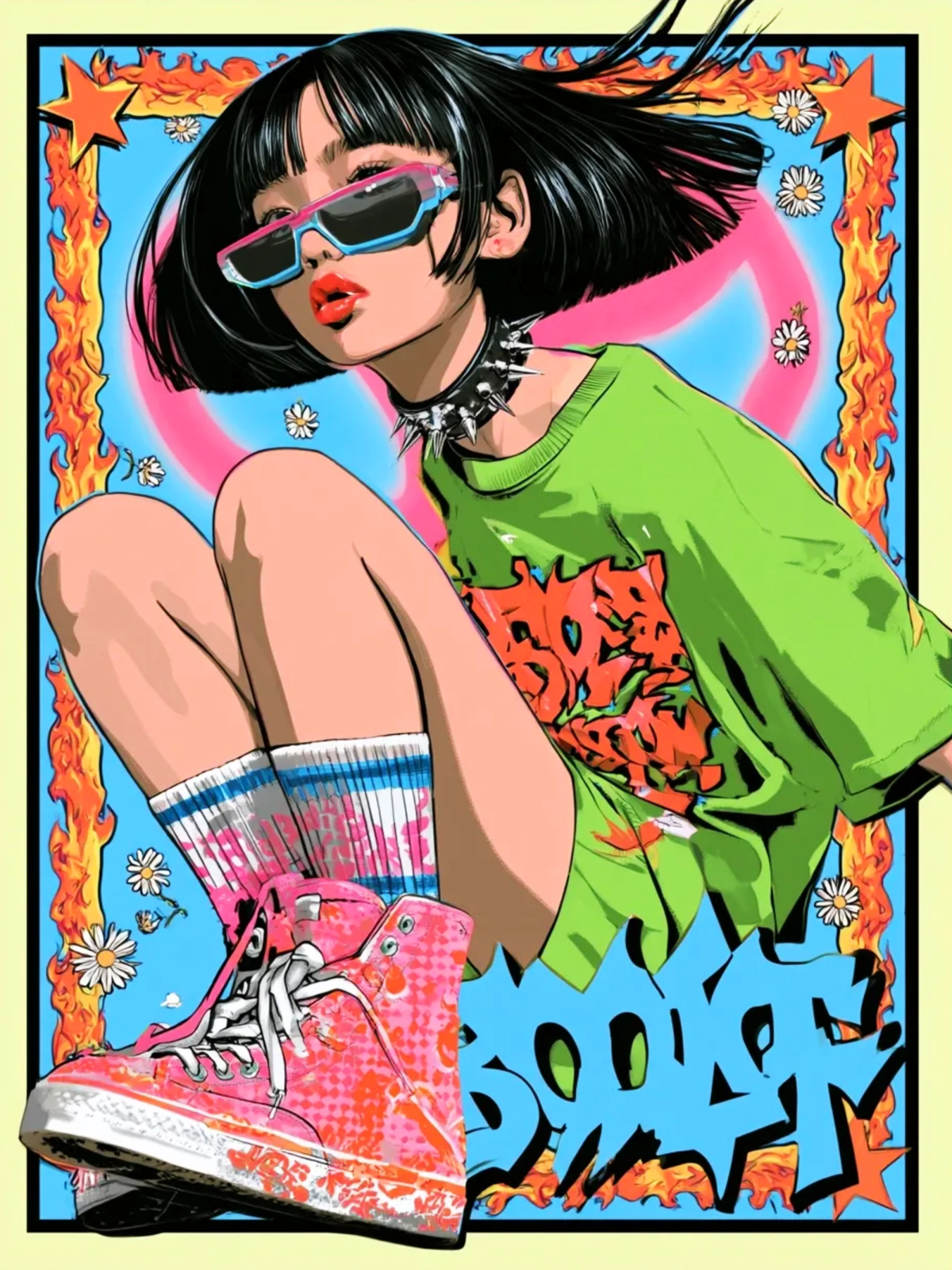
Fiery Rebellion: Eight Portraits Built Like Comic Covers
Bursts, halftone, one acid colour and a face that refuses to smile. A Y2K portrait series that borrows its rules from 90s comic covers — then breaks exactly one of them per image.
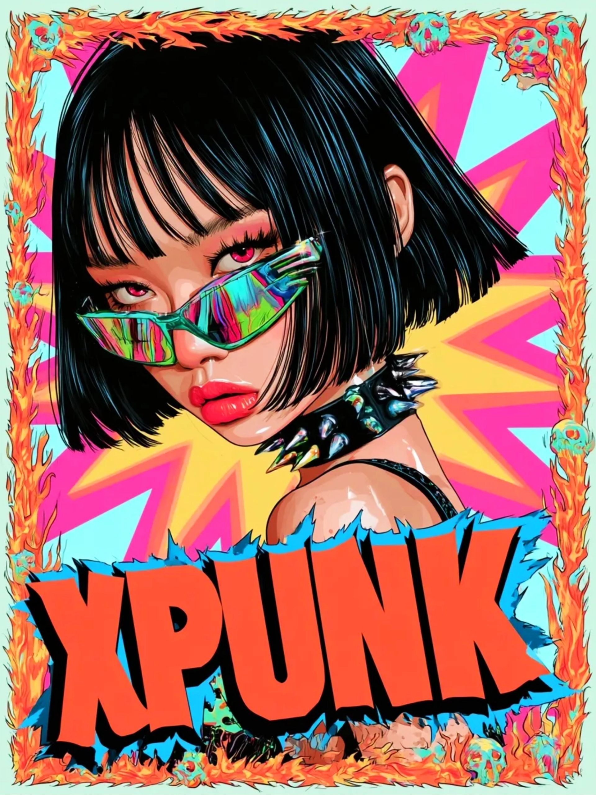
The first rule was boring and useful: every image had to survive at thumbnail size. If the eyes vanished when the picture was 120 pixels wide, the composition was wrong, no matter how good it looked on a big screen.
That single constraint shaped the whole series. Eight portraits, each one built the way a comic cover is built — masthead, burst, a face in the middle, copy crowding the edges — and each one tested at the size people actually see it first.
Cover grammar, not pastiche
A 90s comic cover is a very specific machine. There's a logo block at the top, a radial burst behind the figure, cover lines stacked in the corners, a barcode and a price box at the bottom. It's noisy, but it's not random: every element has a job, and the job is to stop you at a newsstand.
We kept the grammar and threw away the nostalgia. No fake issue numbers, no invented publisher. Just the structure — and a figure that fills it.
Two colours, one scream
Every piece starts with two dominant colours and one that has no business being there. Pink and cyan. Orange and teal. Then a single acid note — a green, a yellow, a violet — dropped in at the smallest possible area.
It's the same trick a loud outfit uses. You don't wear five bright things. You wear two, and then one thing that's slightly wrong.
Restraint is what makes noise read as noise. Otherwise it’s just a mess with good lighting.
The face is the layout
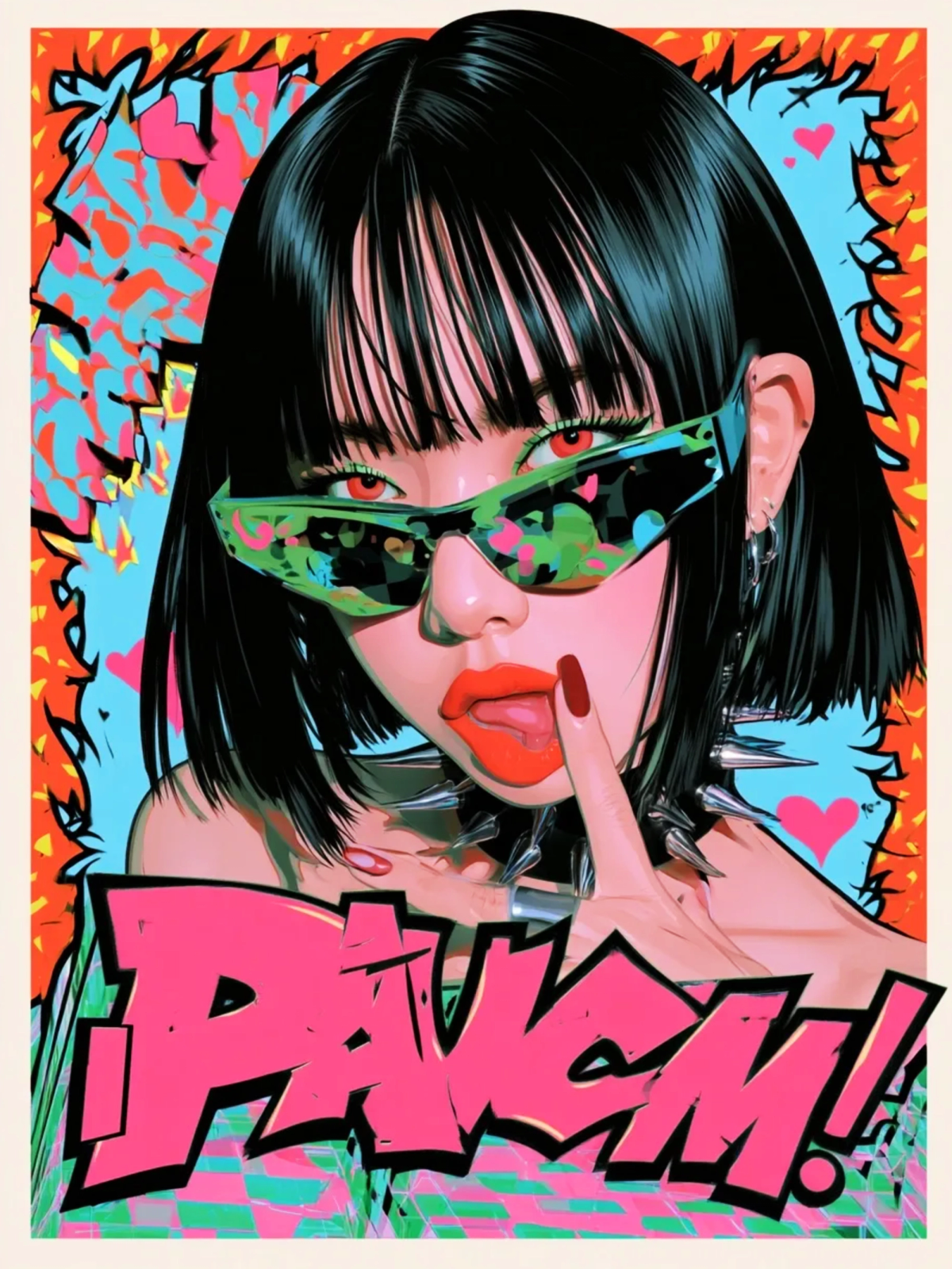
The attitude lives in the eyes, and the eyes sit on the upper third. That's it. That's the whole compositional system. Chin down, gaze up, mouth doing something other than smiling — half-lidded, tongue out, a finger pressed to the lips.
We shot for the expression you make when someone takes your photo without asking, and you decide to enjoy it.
Lettering that behaves badly
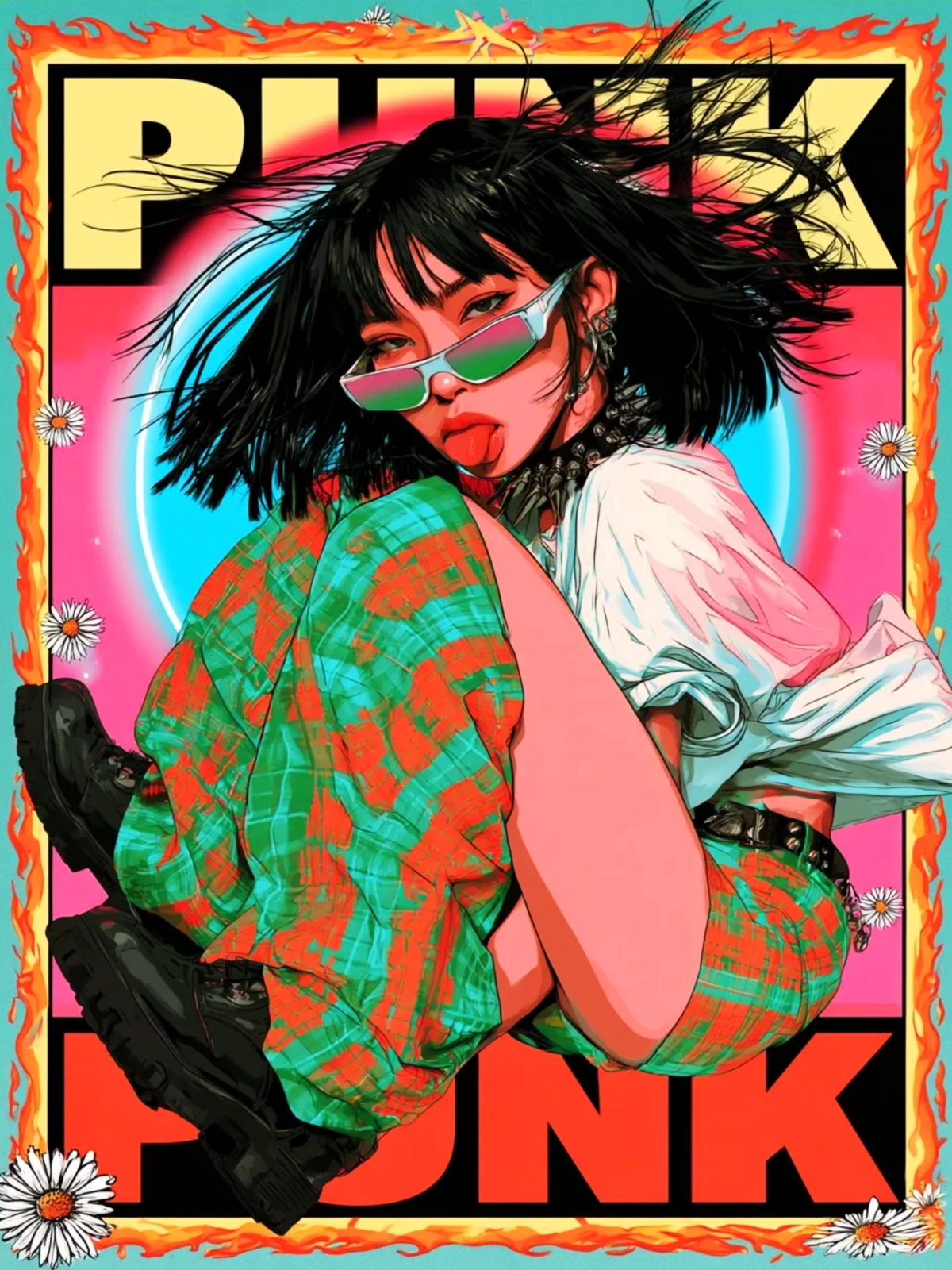
The type in these images is drawn, not typed. It leans, it overlaps hair, it gets half-eaten by the edge of the canvas. That's deliberate: real cover lettering is physical, printed on top of a photograph, and it never sits neatly in a box.
The smaller text — the barcode strip, the price box, the tiny credit lines — is mostly texture. Nobody reads it. It only has to convince you that somebody once did.
One rule broken per image
A series gets boring when every panel obeys the same rules perfectly. So each image is allowed one violation: a masthead that sits too low, a figure that breaks the border, a background that's flatter than it should be.
The violation is what makes the set feel hand-made instead of generated. It's also the hardest thing to describe to a model, which is probably why it reads as human.
What we’d change
Two things. The halftone is a touch too fine in the earliest pieces — on screen it reads as texture, but printed at A3 it would disappear completely. And the set has no quiet cover. Eight loud images in a row is a portfolio; seven loud and one almost silent would be a series.
If we ever print these, that's the version I want: one cover where the burst is missing and the type is the only loud thing on the page.
Eight portraits are on the Fiery Rebellion case page. The rest of the AI Lab is louder than you'd expect from a design studio, and that's on purpose.