design
Luxury Advent Calendar Packaging: Engineering Twelve Windows
Fifteen paper trials, twelve die-cut windows and a foil that kept cracking at the corners. How a Christmas countdown box was built to be kept in February rather than binned in January.
Christmas packaging has an unusually short life. It is bought in November, opened across December, and gone by the first week of January. The brief for this box was to break that pattern: the client wanted something that would still be on a shelf in February, by choice.
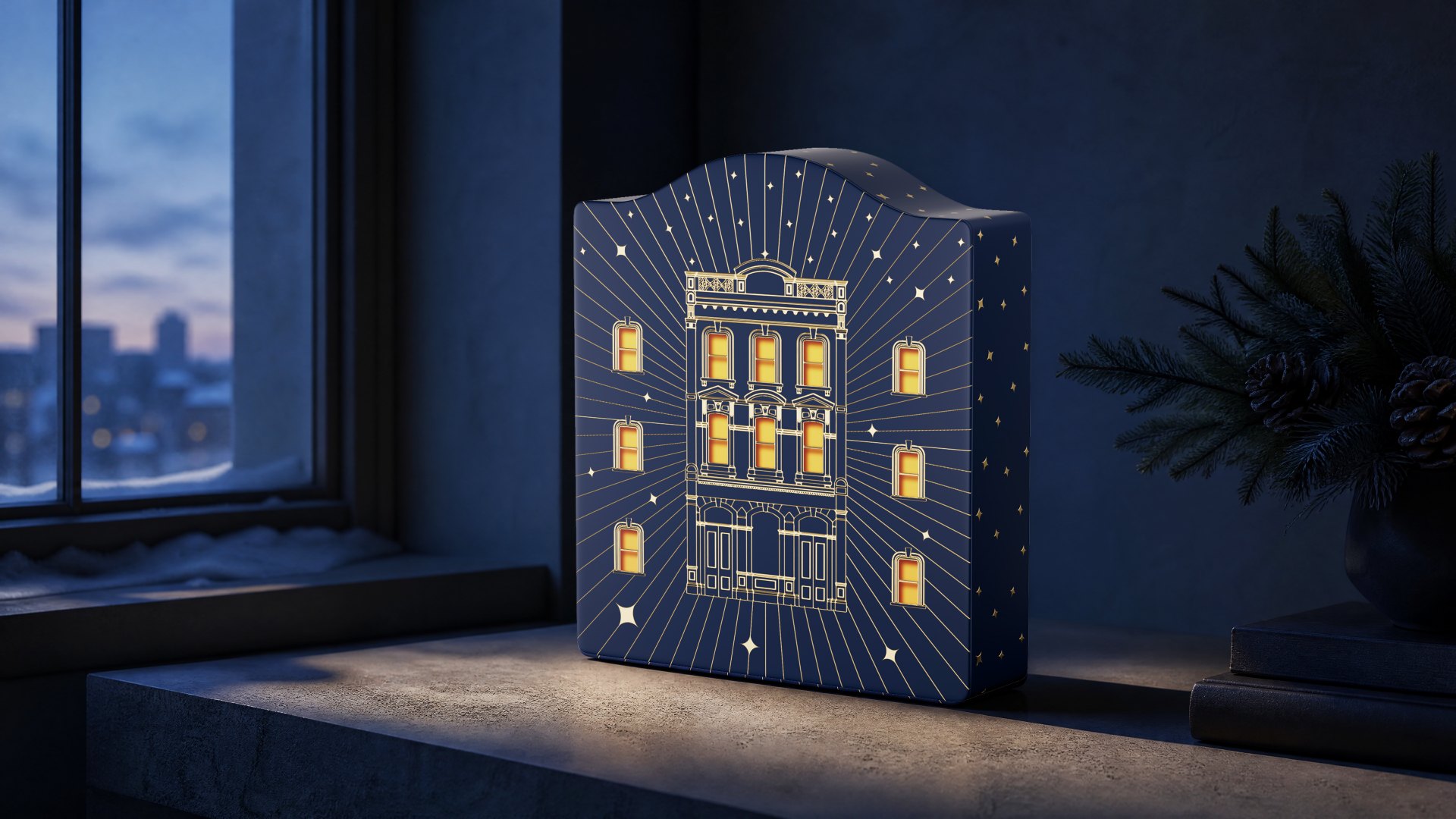
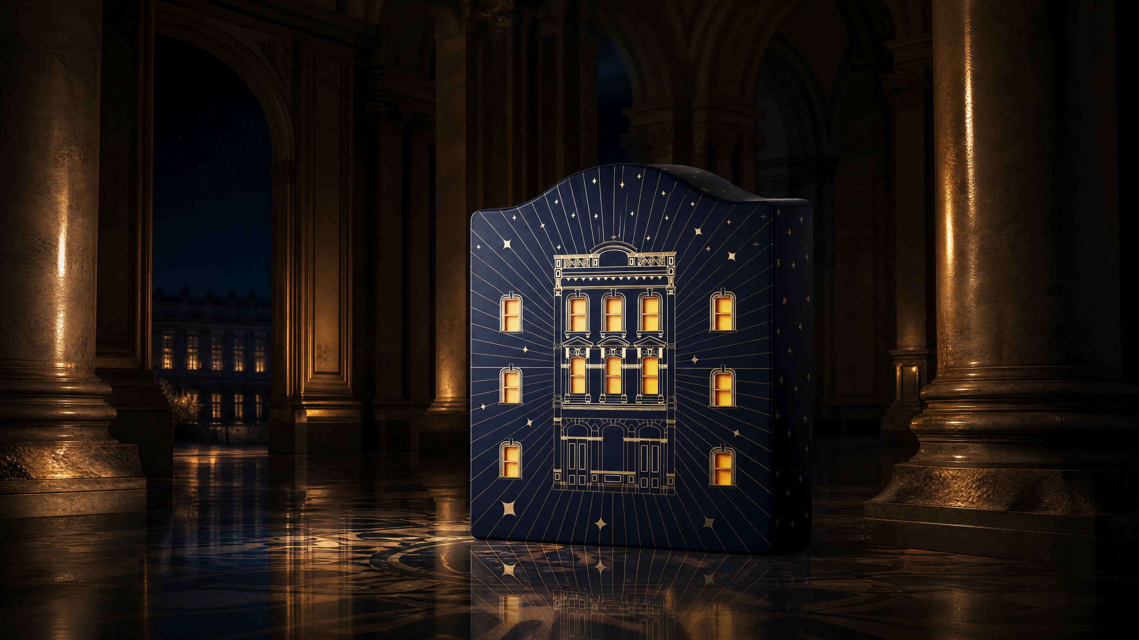
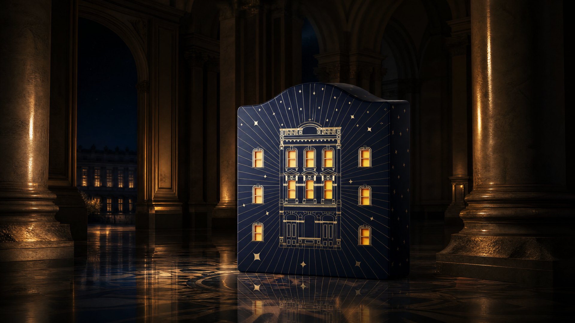
Twelve Orders of Star Eaves is a countdown box built as a building — twelve windows on a facade, one for each night before Christmas, and a structure that opens outward from the elevation inward.
The first twenty ideas were decorations
We went through winter forests, snow globes, fairy-tale castles. All of them looked good in a render and did nothing in the hand. A snow globe is a thing you look at; it has no time in it.
The direction that survived came from a sketch made late at night: a quiet townhouse under a dark sky, twelve windows lit. The moment the windows were windows rather than pattern, the object had a sequence. A countdown needs somewhere for time to live.

Twelve windows is a layout problem before it is an art problem
The first elevation placed the twelve openings wherever they fit. It looked like an advent calendar printed onto a building, which is exactly what it was.
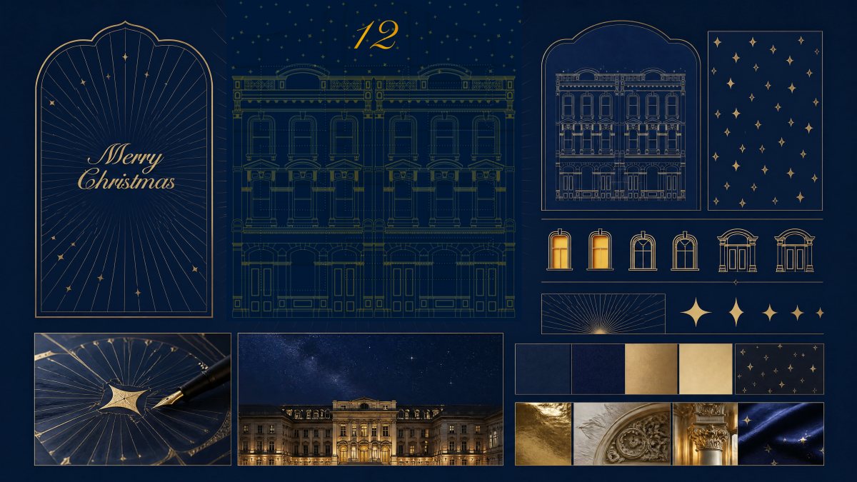
Real facades have rhythm: a hierarchy of floors, a consistent window module, a centre that carries weight. We spent weeks rebuilding the layout around those rules, then broke one of them on purpose. The twelfth window sits off-module, at the top, because the last night should not feel like the eleventh.
Where it actually failed
Three failures, in order of cost.
The first was paper. A facade with twelve apertures loses most of its stiffness. Our initial 1.5mm board sagged about three millimetres across the front within a week of standing, which is enough to make a palace look tired. We moved to a laminated two-ply construction that holds the elevation flat.
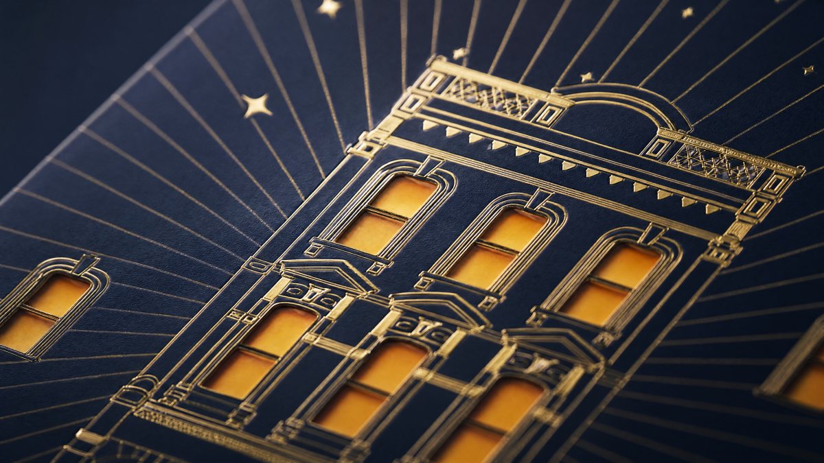
The second was registration. Twelve die-cut windows, each with a gold frame, means twelve chances for a frame to sit a millimetre off its opening. The fix was to cut the windows first and print the frames to the cut rather than the reverse — obvious in hindsight, and it required the printer to accept a different workflow.
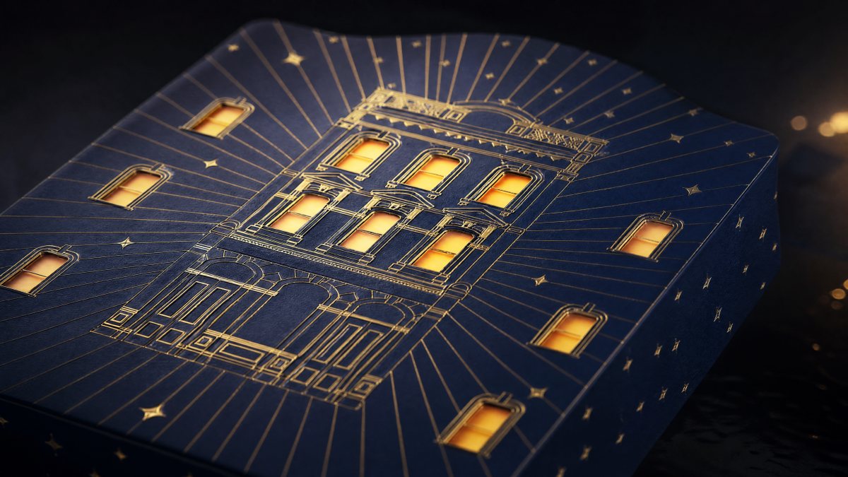
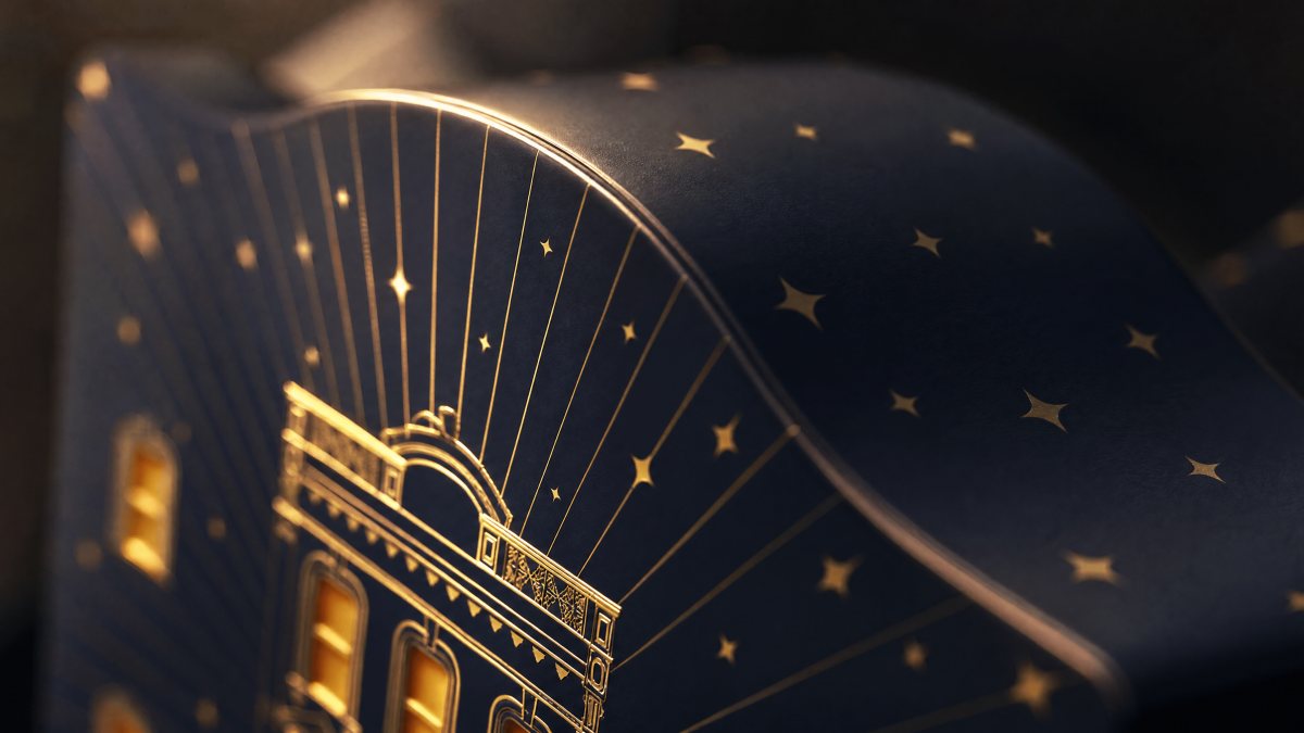
The third was the foil. Gold on an embossed edge cracked at the corners, because foil film cannot stretch around a compound curve. We reduced the emboss from 0.6mm to 0.35mm and split the frame into two passes. The cracking stopped.
Midnight blue is a colour that eats detail
Deep navy is one of the hardest colours to print consistently and one of the easiest to make look grey. Our first samples went dull under indoor light — the exact condition the box would spend December in.
We tested more than fifteen papers. The final choice is a midnight blue stock with a slight warm undertone: it holds its blue under tungsten light and goes almost black in daylight. Gold on it reads as light rather than as metal, which is the whole idea.
A countdown does not end at the last window. The object still has to justify the shelf it occupies in January.
The opening is a floor plan
Twelve apertures on the outside become twelve compartments inside. The structure unfolds from the elevation inward, so the act of opening is closer to entering a building than to lifting a lid.
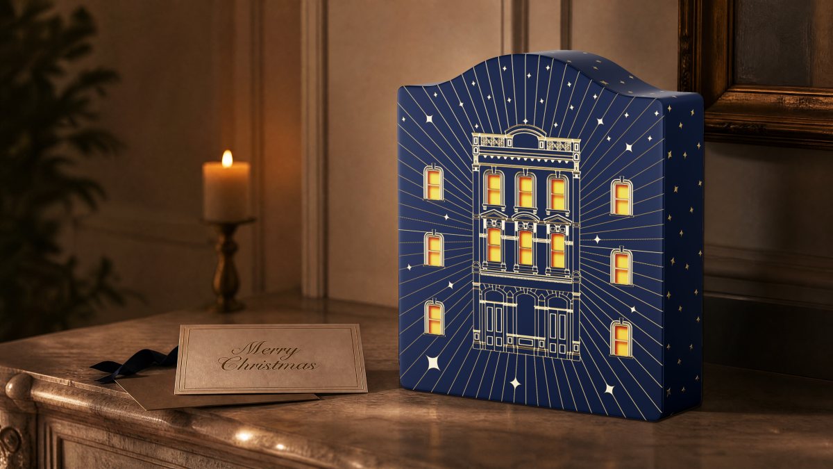
That decision cost us depth: the box is 300mm tall because twelve cells have to stack without crushing. Three hundred millimetres is the height of a shelf, not the height of a bin — a number we chose on purpose, and one that buys the object a second life.
Designing for January
A countdown box has to justify its own storage. Ours holds jewellery, cards, keys — the small things that accumulate on a hallway table. We did not design a second product; we simply refused to design a box that only works for twenty-four days.
What we would change: build the structural prototype before the artwork, not after. Two of the three failures above were structural, and both would have been cheaper to find at sketch stage. The illustrations were never the risk. The paper was.
It also shares a problem with the seven-drawer Ramadan box, at the opposite end of the calendar: there, seven nights had to fit a retail shelf; here, twelve nights had to fit a shelf at home.
What the object is worth
A box like this costs roughly four times a standard advent calendar to produce, and it is not sold at four times the price. The difference is recovered after Christmas: it stays visible, it gets photographed, it gets asked about. That is a marketing asset a printed carton cannot be.
It is also the argument we make to clients who want to skip structure. The cheapest way to be forgotten is to be disposable — and in a category where everything is thrown away in the same week, being kept is the only differentiation that lasts. The rest of our packaging work runs on the same premise.