design
Luxury Fragrance Packaging Design: The Case for a Slower Opening
A rigid fragrance gift box is judged in the first three seconds and again at the tenth opening. How LOKKI tuned a two-stage hinge, a sunken foil channel and a flocked tray for three bottle formats.
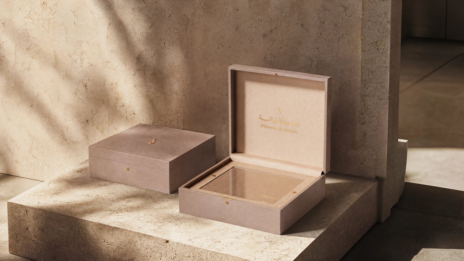
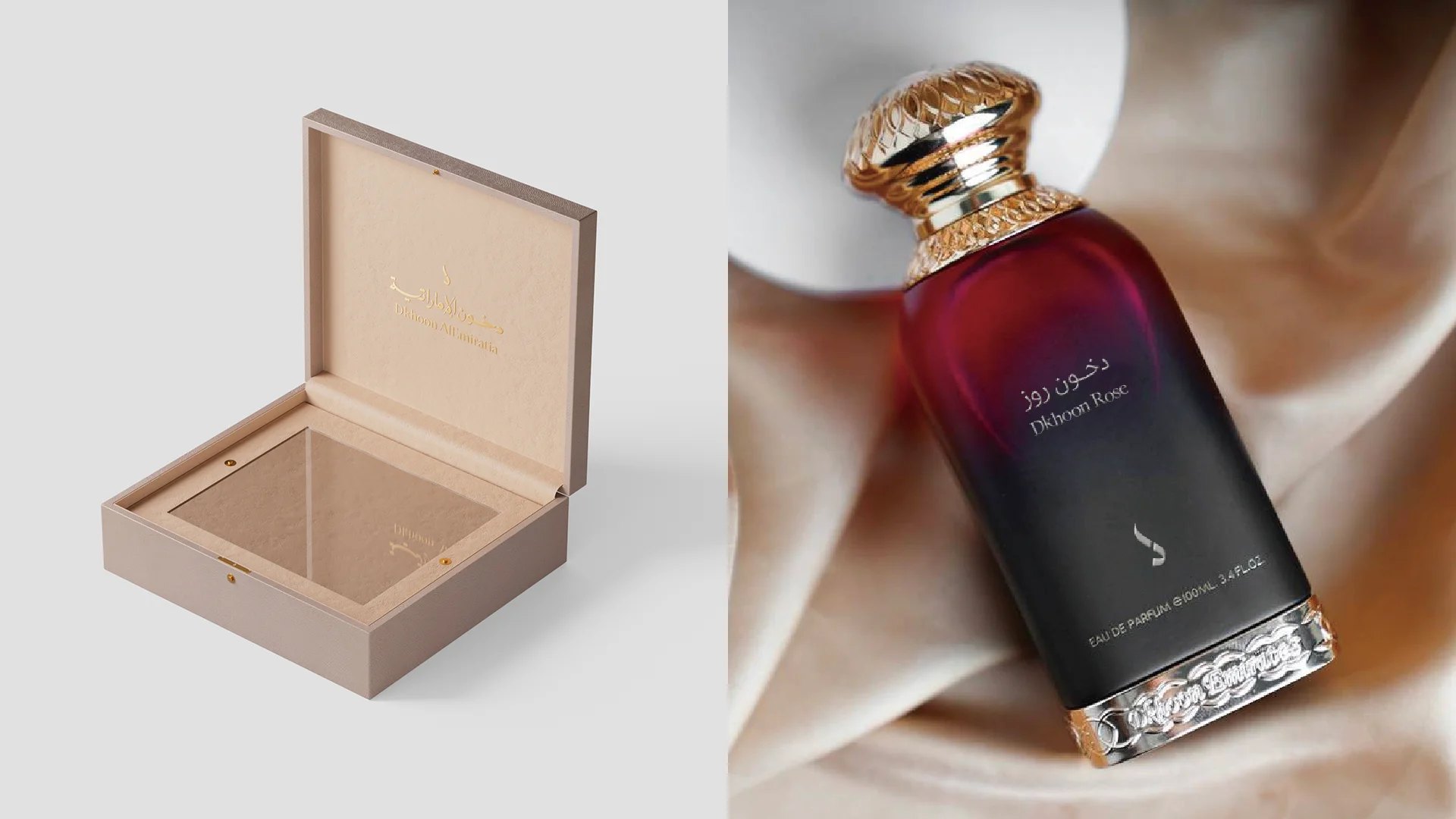
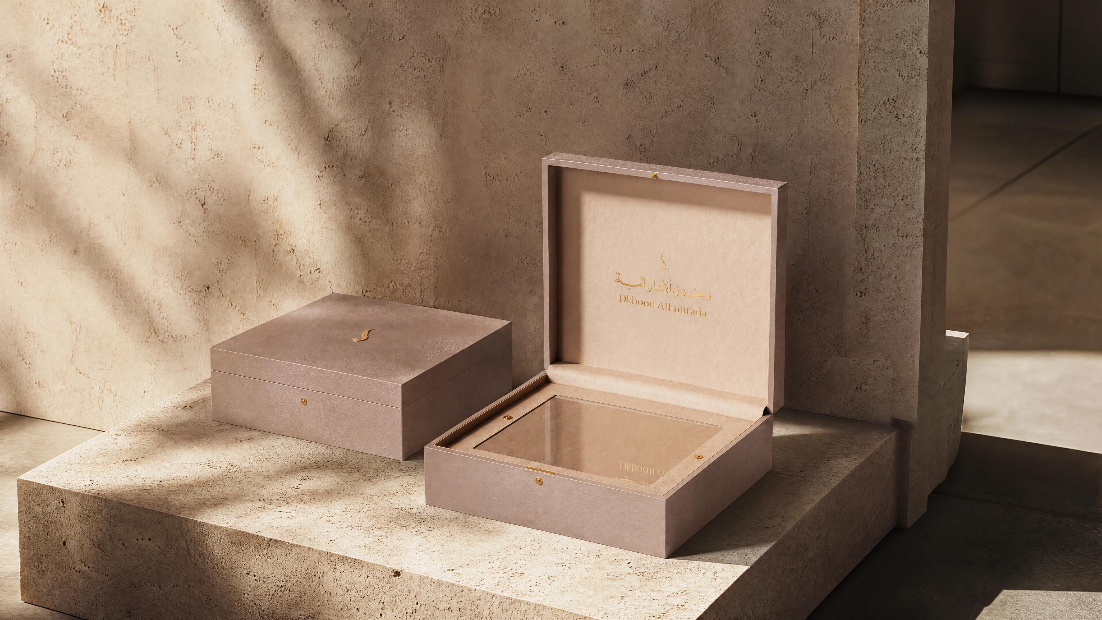
Most fragrance packaging is designed for the photograph. It has to survive a campaign shoot, a shelf and a scroll. What it rarely has to survive is being opened — properly, by hand, in ordinary light, by someone who has already decided to buy.
Realm of Fragrance Unfolded started from that gap. The house gave us a blunt brief: the box had to feel expensive before the bottle was seen, and it had to still feel expensive on the third opening, not only the first.
Three constraints that decided everything
The first was format. One box had to hold a full-size flacon, a travel spray and a refill cartridge without reading as a sampler set. That distinction is almost entirely structural: a sampler divides its contents into equal cells, while a gift box gives every object its own posture.
The second was material honesty. In this category gold foil is the default, which means it no longer signals anything. The third was operational: the lid had to open one-handed behind a counter, while an assistant is talking, without the whole thing tipping forward.
The first prototype opened. That was the problem.
The first white sample did exactly what a rigid box does. The lid released with a thin plastic click and then sat in the hand at a careless angle, and the object immediately became a box again — a container, not a thing.
We had built the closure around a standard magnetic catch. It is cheap, reliable and completely characterless: a magnet either holds or lets go, with nothing in between. What the object needed was a hinge that resisted for the first fifteen degrees and then agreed.
We kept the lid line dead straight and moved the drama inward, where it would be discovered rather than announced.
The exterior stays quiet on purpose. Everything the box has to say happens after the seal is broken.
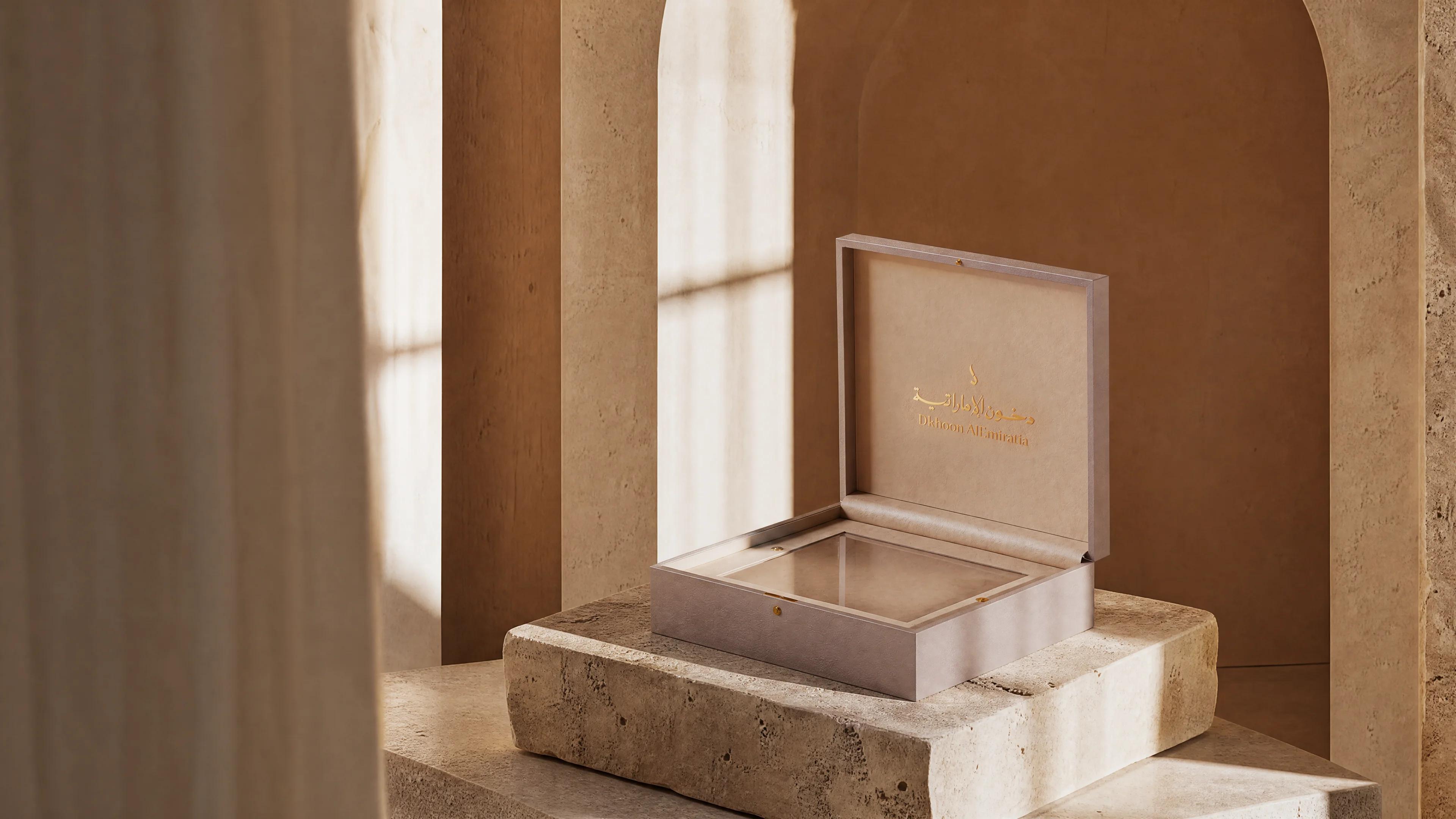
A detent, not a magnet
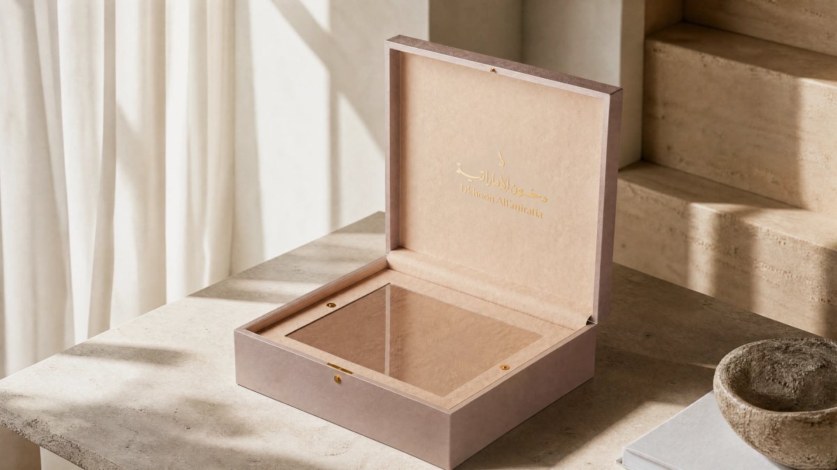
The production answer was a two-stage detent. Two magnets sit at different depths behind the front board, and a paper hinge liner adds friction progressively instead of all at once. The lid now stays shut until you mean it, opens against light resistance, and holds itself at roughly a hundred degrees — enough to present the bottle without falling back.
On a structural drawing that change is four lines. In the hand it took four rounds of physical prototypes, because paper does not behave like the drawing. Humidity moves it, and two tenths of a millimetre in liner caliper changes the entire feel of the opening.
Foil is where budgets quietly die
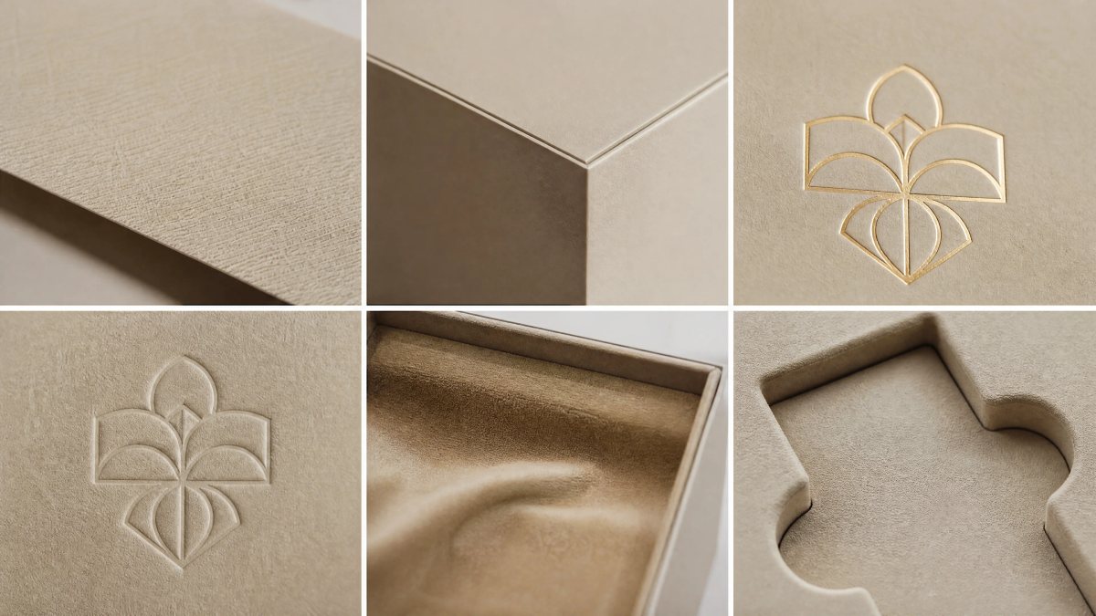
Gold foil on textured stock is the fastest way to make packaging look expensive and cheap at the same time. On a coarse sheet the foil sits on the peaks of the fibres and skips the valleys, so under raking light the edge of a letterform looks torn. Our first pass had exactly that problem on the spine.
We tested three routes: a hotter, coarser foil; a smooth stock with printed texture; and a deeper deboss channel that lets the foil sit below the surface. The third won. It adds a die pass and roughly six per cent to unit cost, and it is the detail nobody notices until a thumb crosses it.
Luxury is not an amount of material. It is the consistency of a few decisions, repeated every time the object is handled.
Inside is where a gift stops being a sample
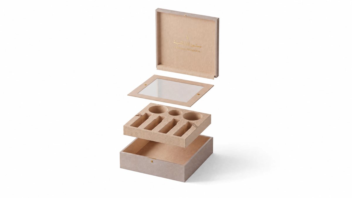
The interior is flocked, but not uniformly. The bottle well is four millimetres deeper than it needs to be, so the glass settles instead of resting on a ledge. The travel spray sits in an angled channel, because a vertical slot reads as a sample and an angled one reads as a set.
Under the refill cartridge there is a ribbon. It is not there to lift the cartridge out. It is there so the cartridge looks placed rather than packed.
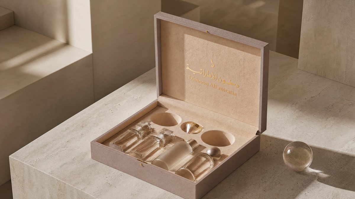
Why not white
The obvious route for a fragrance box is white: it photographs cleanly, it reads as clinical purity, and every printer can hit it. It is also the reason so much of this category looks interchangeable on a shelf.
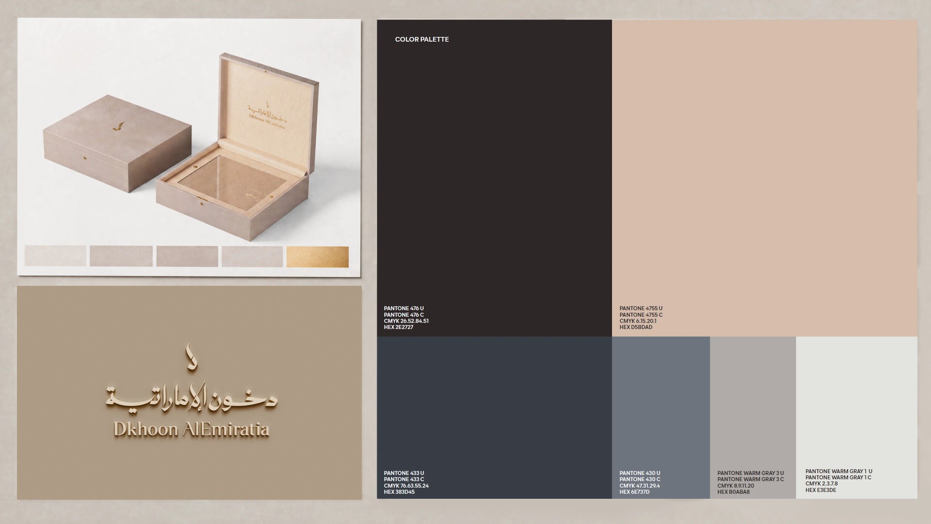
We moved to a warm neutral with a faint clay undertone, and paired it with brushed champagne rather than yellow gold. Under shop lighting the box goes slightly pink instead of slightly grey, which is a small thing that separates it from everything within two metres. It is also the problem we ran into on Bora-Bora, where colour had to carry what structure could not.
The press check that saved the neutral
The first press check came back two points too yellow. On a warm neutral that is the difference between paper and cardboard, and it only shows under 5000K light — which is exactly the light in a fragrance hall, and exactly the light nobody uses in a proofing booth.
We changed the ink sequence, printed the neutral last instead of first, and put three per cent grey into the varnish. The second check matched the approved drawdown under three colour temperatures. None of it is visible in a photograph. All of it is visible in a room.
What shipped, and what we would change
The final system covers two box sizes and three product formats, with one master shipper and a single foil pass across every printed surface. From approved artwork to first delivery was six weeks, including two full press checks. It now sits with the rest of our packaging work, where the same question keeps returning in different materials: how much of an experience can be built before the product is touched.
Two things we would do differently. We would test the opening with gloves on much earlier — a boutique in winter is a room full of leather and cold hands, and our first hinge pull was tuned on bare fingers in a warm studio. And we over-designed the outer shipper: it was beautiful, and it added eleven days for a component the customer sees for four seconds.
What this project confirmed is narrower than "detail matters". It is that luxury is a small number of decisions held consistently — the same resistance at the tenth opening as at the first, the same edge under a thumb six months later.