design
Punk Cosmic Portraits: Covers for Comics That Don't Exist
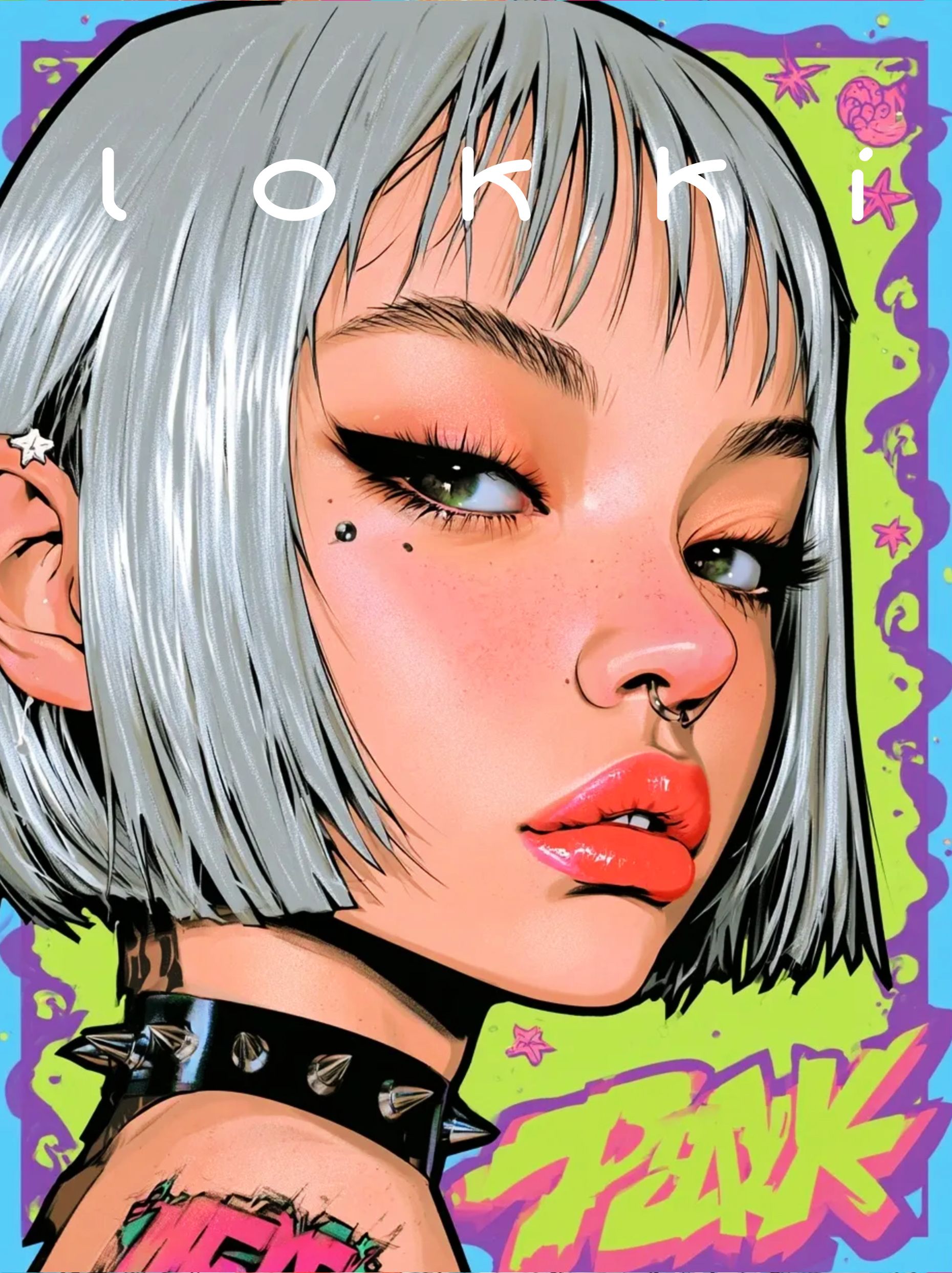
Punk, astronauts and vintage motorcycles, printed like covers for books nobody wrote. How one rule — the portrait has to look like it's selling something — built a whole series.
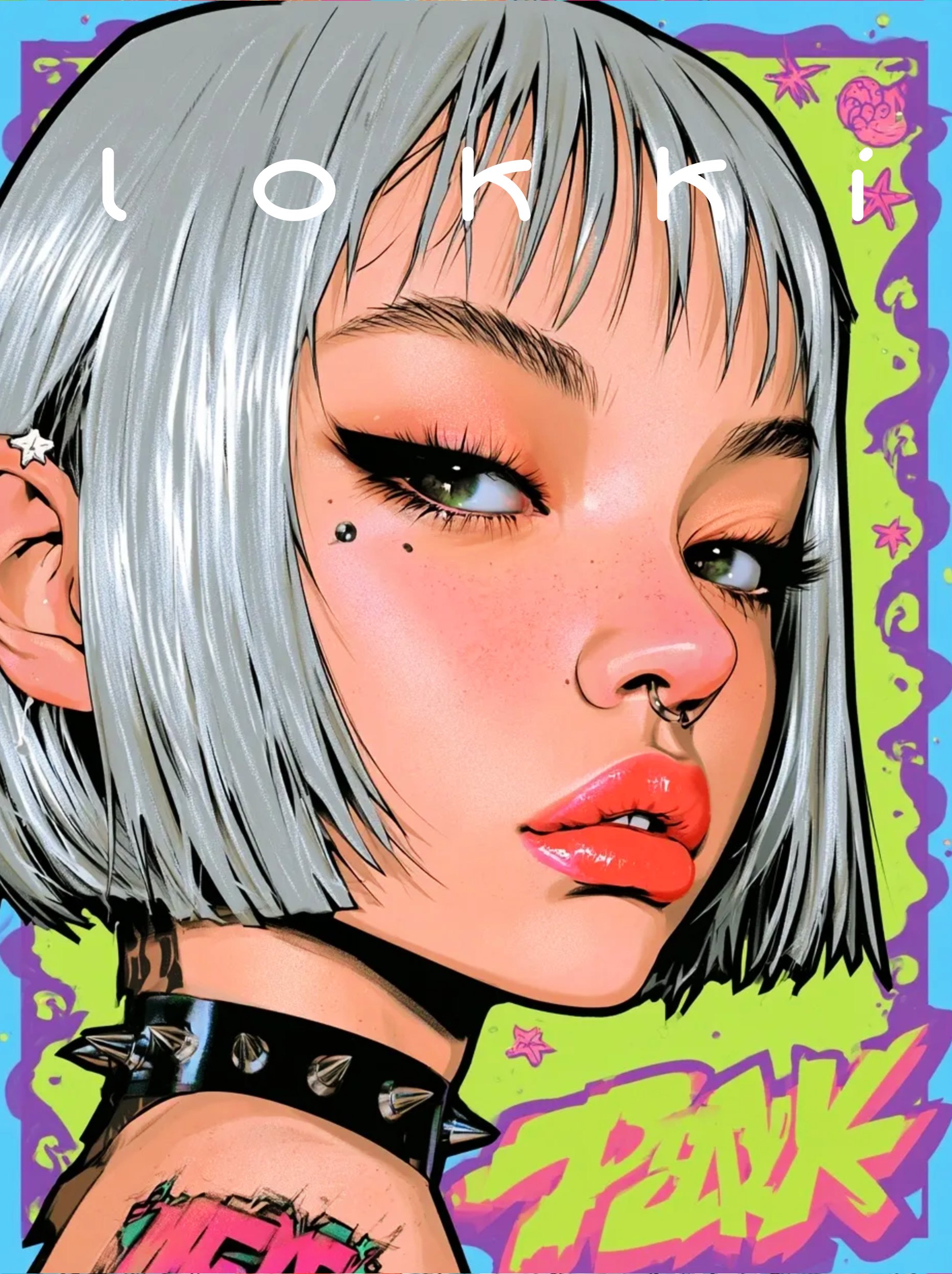
A comic cover is a promise. It says: there is a story inside, it is already in progress, and something is about to go wrong. None of that has to be true. The cover just has to look like it is.
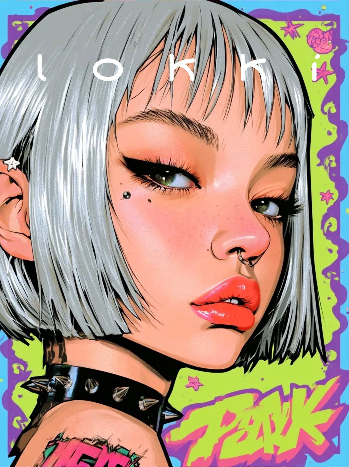
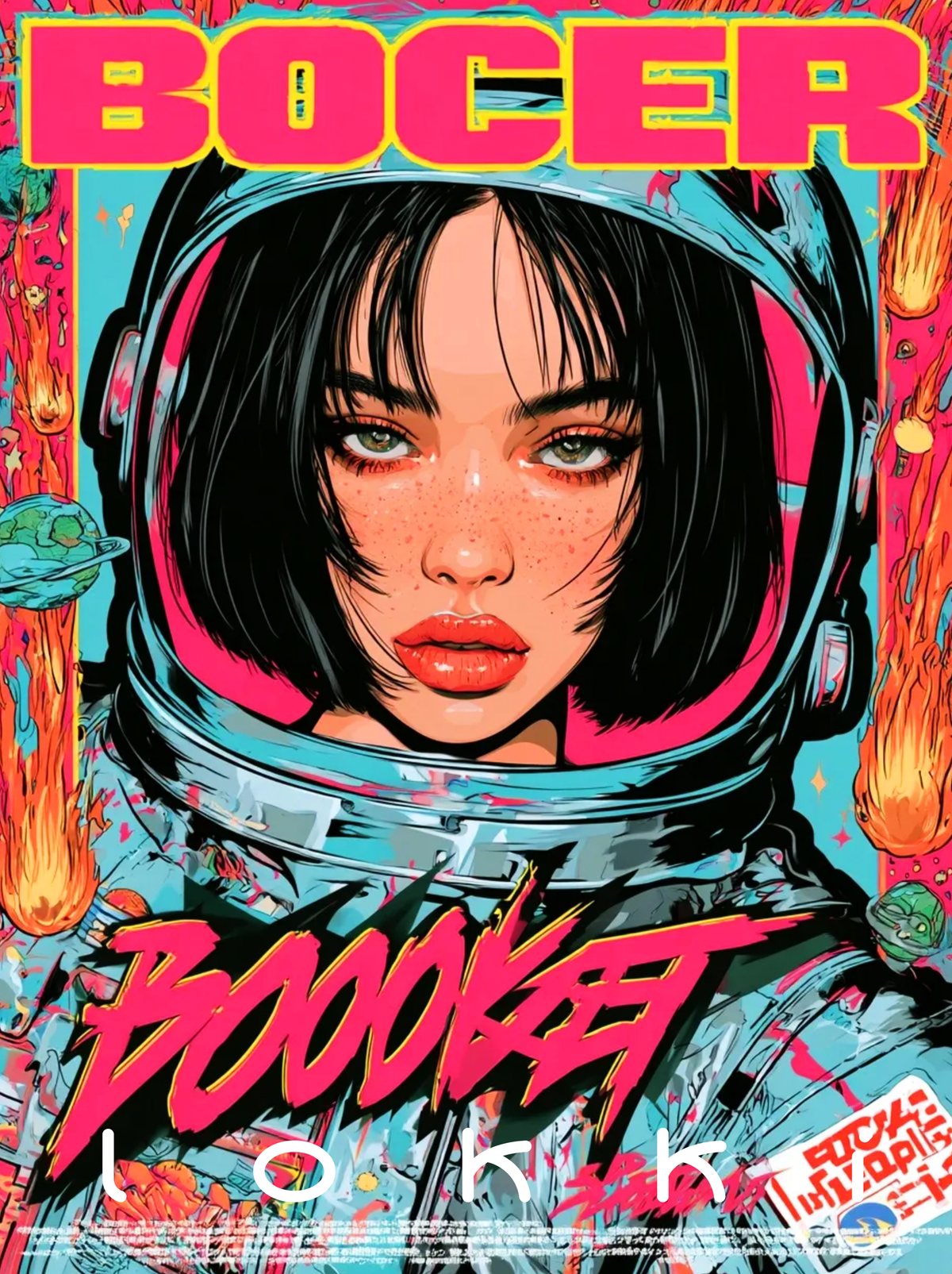
That's the game this series plays. Eight portraits, each one designed as the cover of a comic that was never written, with a masthead, a number, a barcode and a price in the corner.
A cover implies a story
The trick is to imply more than you show. A cropped logo suggests the rest of the word. A helmet suggests a mission. A motorcycle entering the frame from below suggests the rider got here fast and is leaving faster.
We never wrote the stories. But we did decide, for each image, what the issue would be about — and then removed everything that wasn't needed to say it.
Three vocabularies, one face
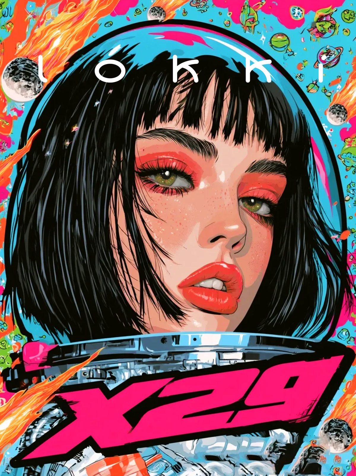
Punk gives you studs, leather and a refusal. Space gives you chrome, vacuum and scale. Vintage motorcycle culture gives you grease, chrome again, and a certain kind of posture. None of them belong together, which is exactly why they work.
The face holds the collision together. If the expression is calm, the surrounding chaos reads as a world rather than a costume.
Rebellion looks silly when the person inside it is trying. It looks dangerous when they’re bored.
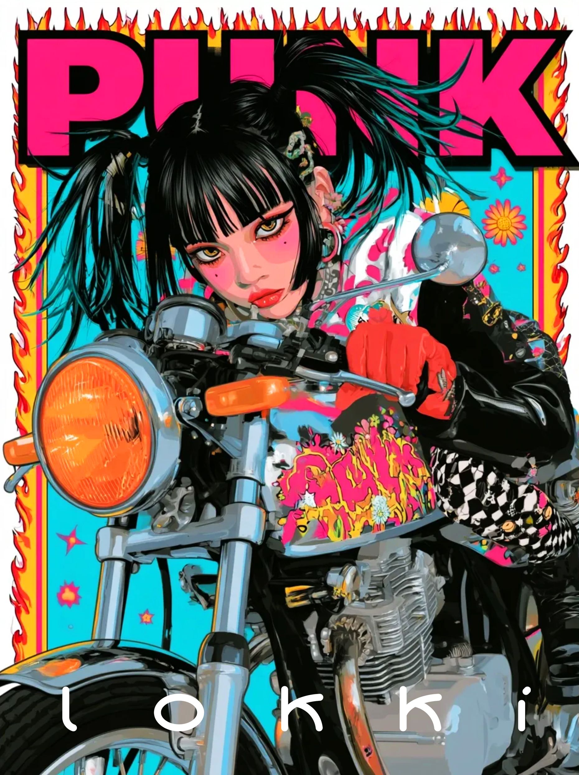
The motorcycles are drawn like machines, not props: engine fins, cable routing, the shape of a headlight. The more accurately the bike is drawn, the more the girl on it looks like she owns it.
That's also a quiet nod to the studio's other work. Packaging and product photography teach you that a badly drawn object ruins an entire image, no matter how good the face is.
The serial number problem
A series of covers needs to feel like it comes from a publisher. That means consistent furniture: the same masthead position, the same corner blocks, the same tiny type at the bottom.
It also needs variation, or it becomes a template. Our rule was that the furniture stays fixed and the lighting changes — daylight, vacuum, neon, fire. Same publisher, different books.
Why not just draw a comic?
Because the cover is the interesting part. A panel has to explain; a cover only has to seduce. It's closer to poster design than to storytelling, and it lets a single image carry a whole fictional world without proving anything.
It's also honest about how illustration works commercially. Most of the images a studio makes are, in some sense, covers — for products, for launches, for things that need to stop a thumb.
The barcode problem
The small print at the bottom of a comic cover is almost entirely fictional: a barcode, a price box, a line of publisher credits, a date. None of it needs to be readable. It needs to be plausible.
Getting that right is mostly restraint. The type has to be small enough to become texture and regular enough to look typeset rather than hand-scrawled. Too clean, and the cover looks like a poster pretending to be a comic. Too messy, and it looks like a prop.
All eight are on the Punk Cosmic Portraits case page. The other five series are in AI Lab.