Golden Thread Ritual
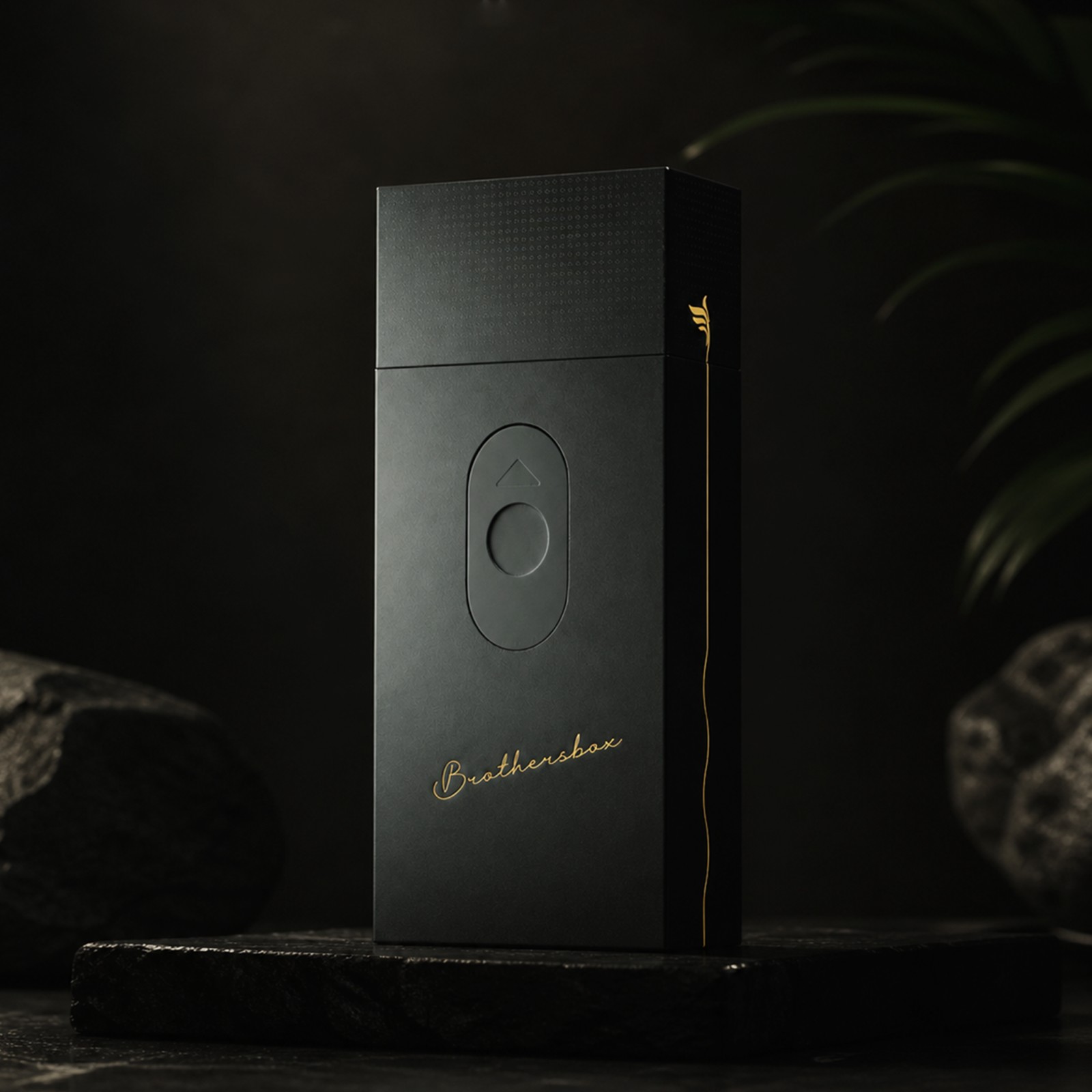
Brothersbox is a premium cigarette case crafted for male social occasions. Using matte‑black base and golden‑line detailing, it encapsulates the quiet, deep bond between brothers into a palm‑sized object.
02 / Project Overview
Giving the Gesture of Offering a Cigarette Its Rightful Ritual
In Eastern male social culture, offering a cigarette is a subtle gesture that carries greeting, respect and closeness. Yet most cigarette cases on the market remain purely functional, lacking emotional expression and quality distinction. Brothersbox aims to redefine this everyday object — through structural innovation, visual restraint and material refinement, elevating it from a mere container to a social prop, an extension of the user's taste and attitude.
- Category
- Packaging Design
- Focus
- Sliding Structure, Tactile Ritual, Black-and-Gold Identity
- Designer
- lokki
- Object
- Premium Cigarette Case
- Audience
- Male Social Moments
03 / Challenge
How to Make a Cigarette Case Both Restrained and Substantial?
The core tension lies in balancing restraint with presence. Within its compact form, the case must convey premium quality without feeling over-decorated. Structurally, it requires a smooth, reliable sliding mechanism while staying slim and portable. Visually, it needs layers and memorability within a minimal black palette — recognisable on a table, in the hand, and in social settings. We had to find the precise intersection of size, feel, aesthetics and cost.
04 / Insight / Strategy
Masculine Sophistication Is Precision Within Minimalism
We recognised that our target user defines sophistication not through complexity, but through precision — every line and every touchpoint exactly where it should be. Our strategy was therefore subtractive: a broad matte-black base establishes a calm tone, while a single thin gold line provides the only visual accent; the sliding mechanism makes the act of opening rhythmic and anticipatory. The entire design language revolves around quiet power — never loud, but every detail rewards scrutiny.
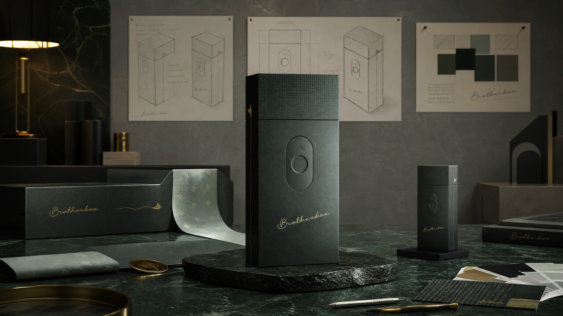
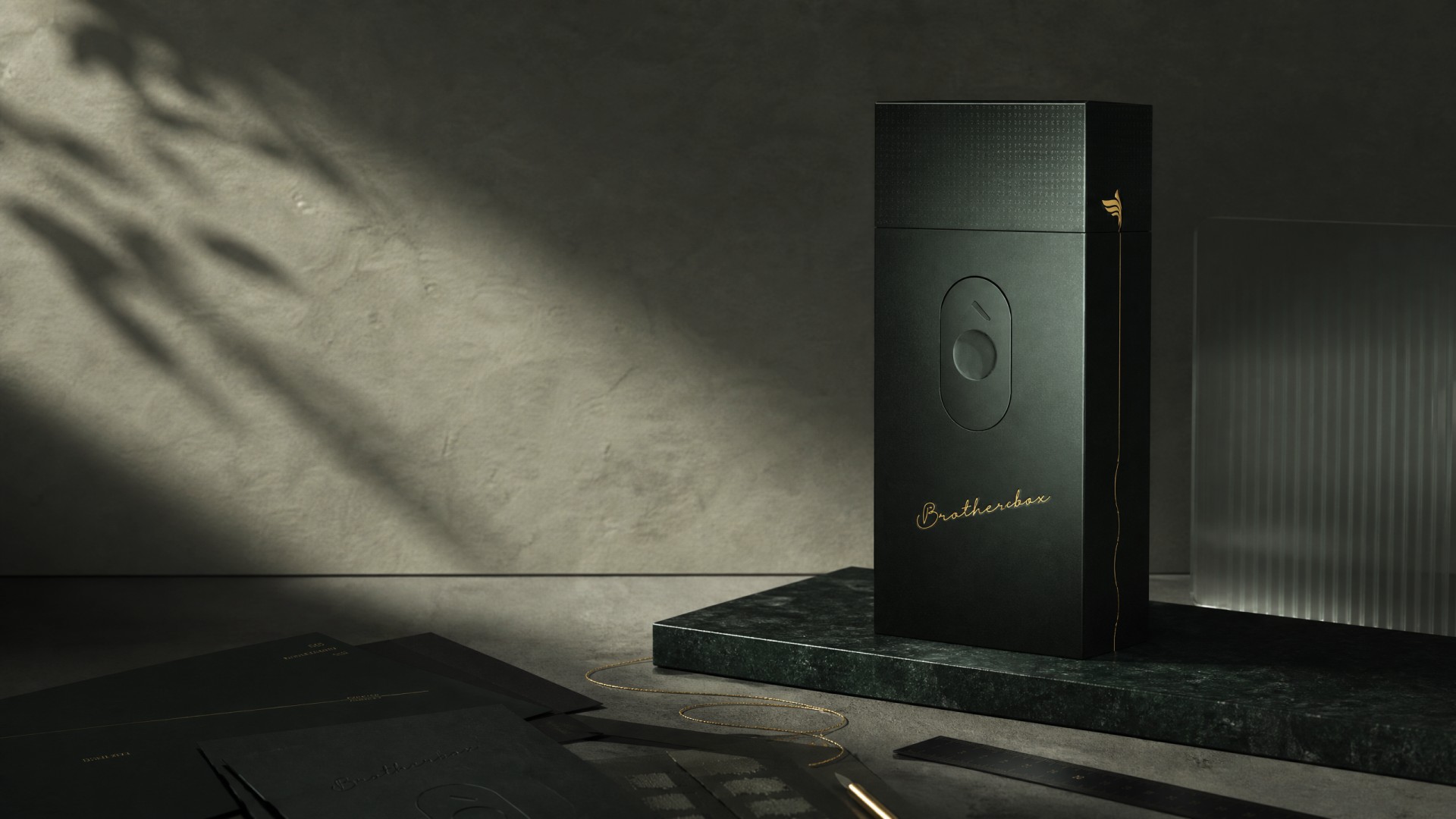
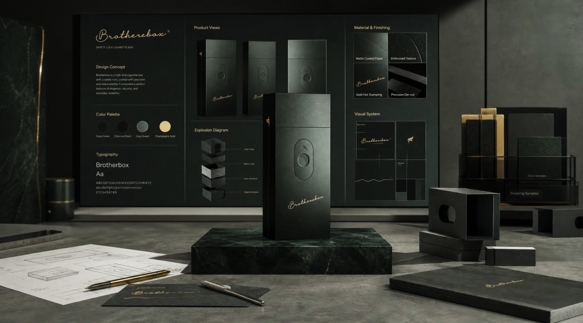
Full‑scene presentation of packaging system, displaying main box, secondary container, inner wrapping paper, brand stationery and early concept sketches. Unified matte surface and hot‑stamp gold details run through the whole brand visual.
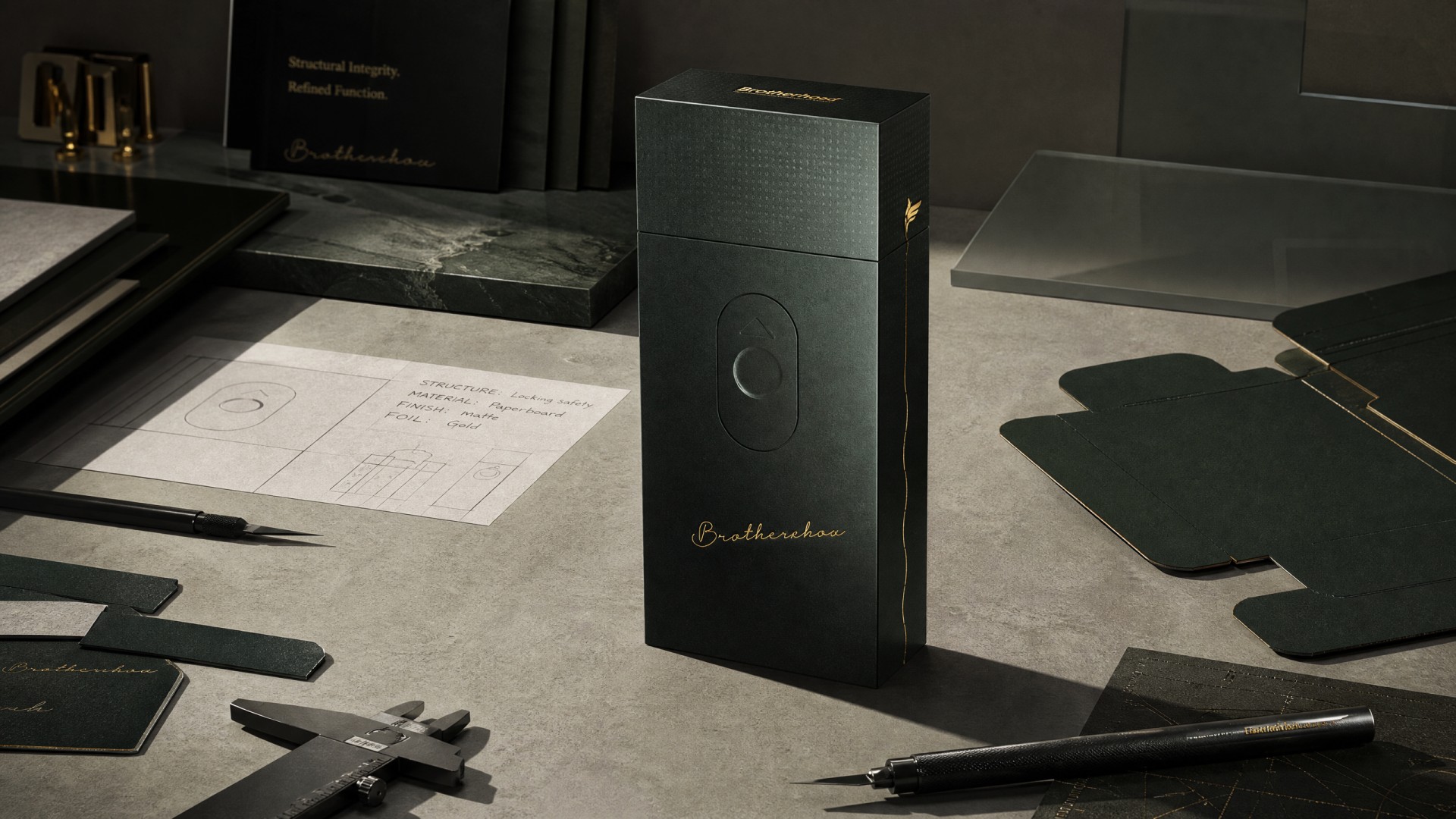
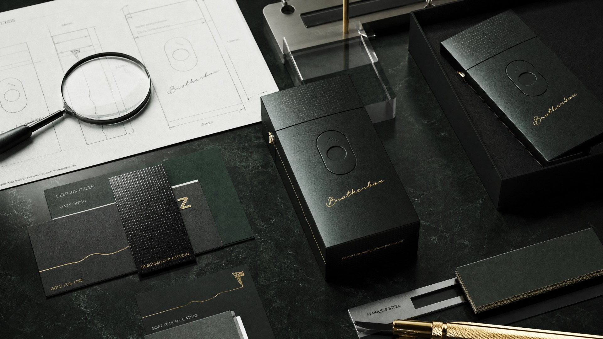
Connecting final packaging render with early‑stage design work. Concept sketches, die‑cut templates and measuring tools reflect the iterative process of structural refinement.
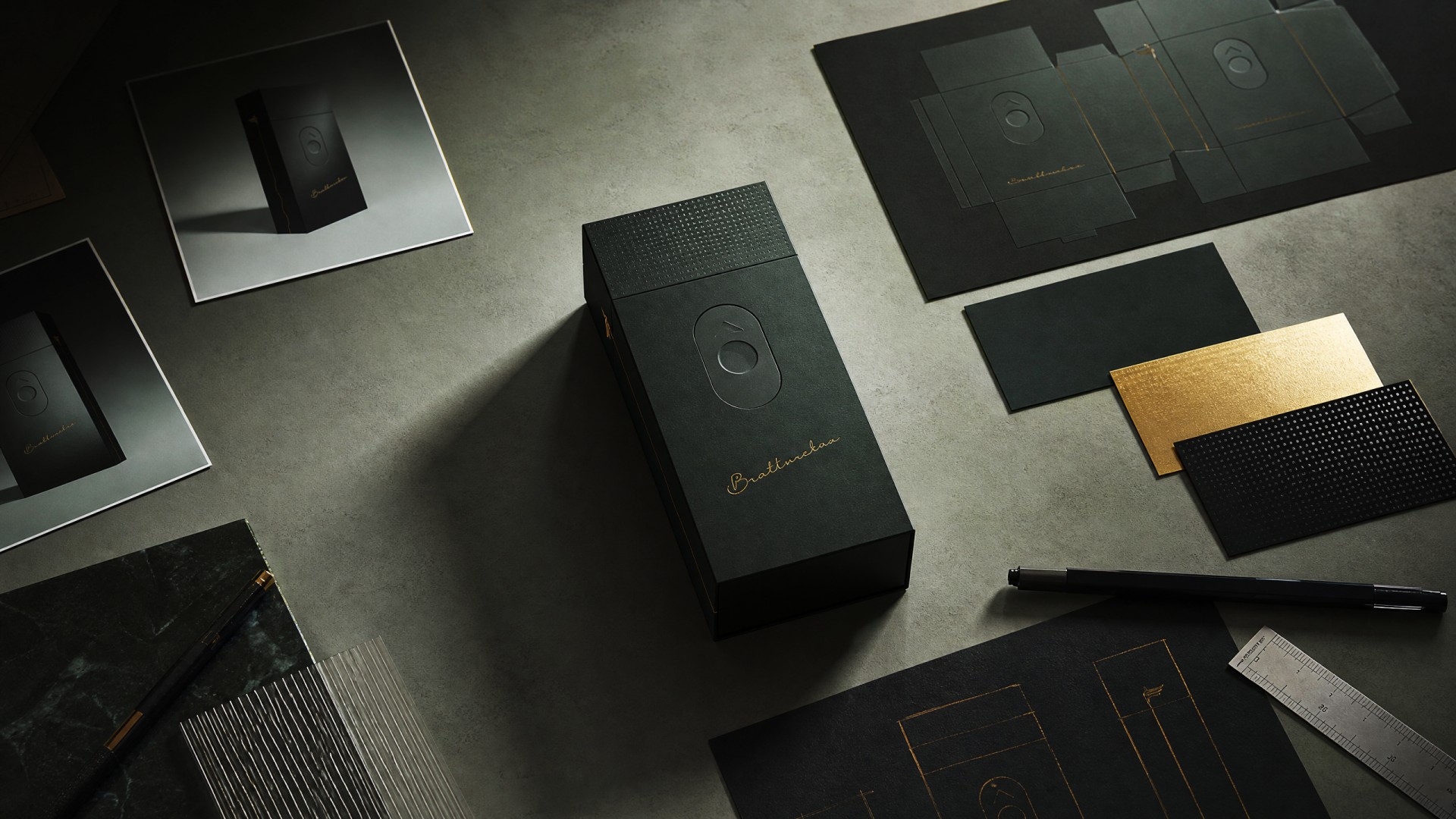
05 / Core Concept
A Single Gold Line — The Unspoken Thread Between Brothers
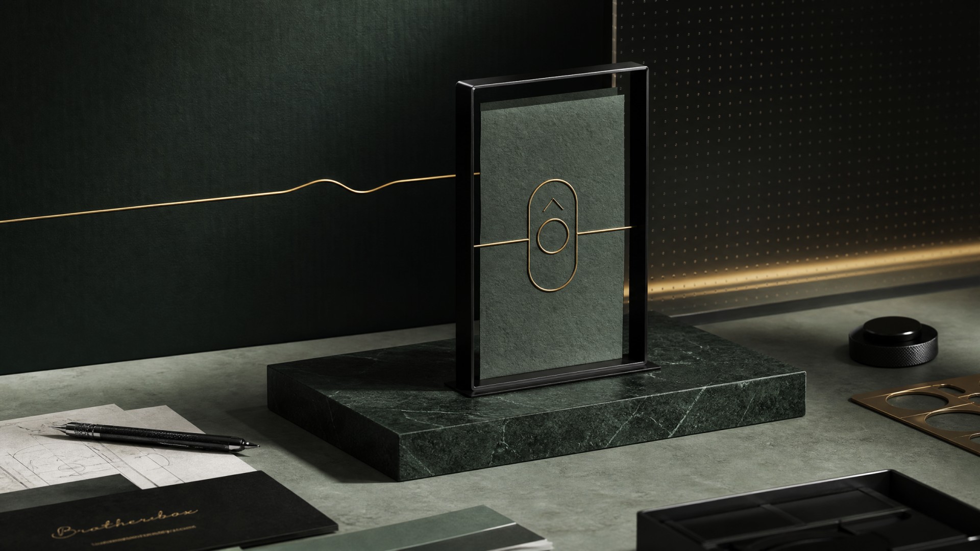
The core concept originates from the emotional essence of brotherhood — a bond between men often expressed not in words, but as an invisible yet constant thread. We materialised this thread as a thin, winding gold line running down the side of the case. It begins at the leaf emblem on top, flows naturally along the box's contour, and converges at the base. It is both decoration and metaphor: like the arc of a relationship — silent, continuous, unbreakable. The oval slider on the front is this thread's switch; a gentle push and the bond unfolds.
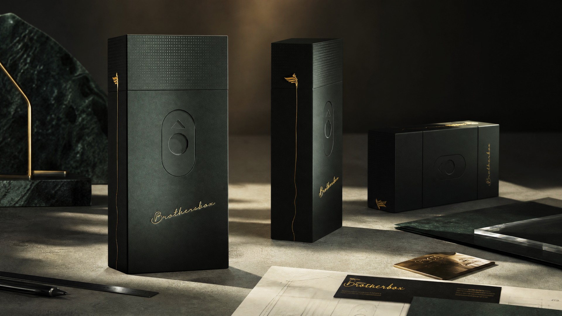
The golden line motif consistently appears across every box orientation. Whether front, side or secondary package, this subtle hot‑stamp element unifies the whole product family under one core concept.
06 / Visual System
Black as Canvas, Gold as Language, Form as Boundary
The visual system is built on three core elements: matte black as the base, gold line as the sole high-saturation symbol connecting the emblem, side detail and handwritten logo, and the oval slider as a functional graphic embossed into the surface. Together they form a restrained, precise and highly recognisable VI system.
07 / Structure & Experience
In a Single Push-and-Pull, Rhythm Is Attitude
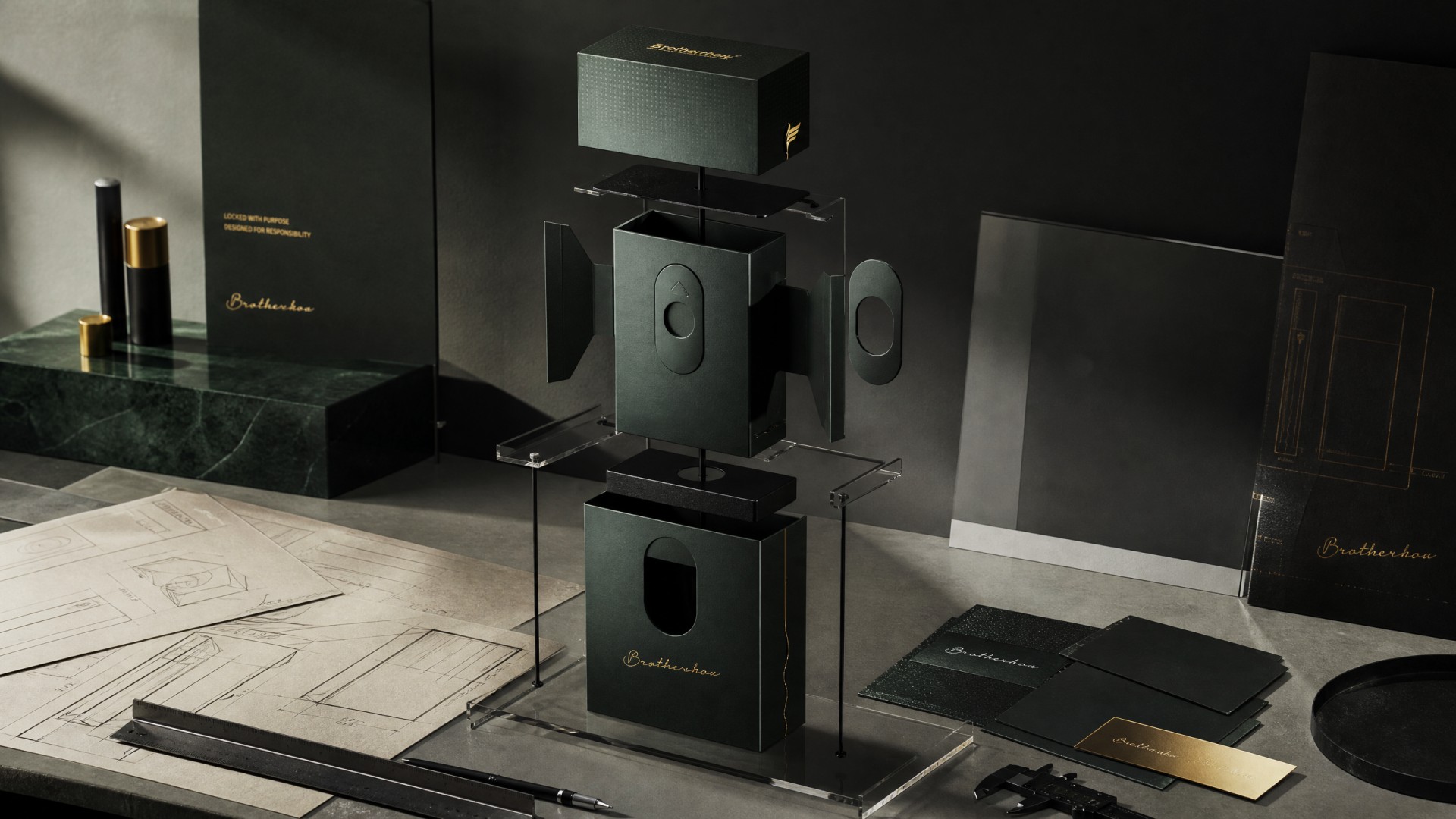
Brothersbox employs a dual-layer drawer-sliding structure. The outer sleeve is fixed, with an oval finger recess on the front; the inner tray holds the cigarettes and slides out beneath a textured decorative cap. The resistance is calibrated to be neither stiff nor loose, perfectly simulating an unhurried rhythm. When fully open, the light interior contrasts with the dark exterior, turning the everyday act of taking a cigarette into a miniature ritual.
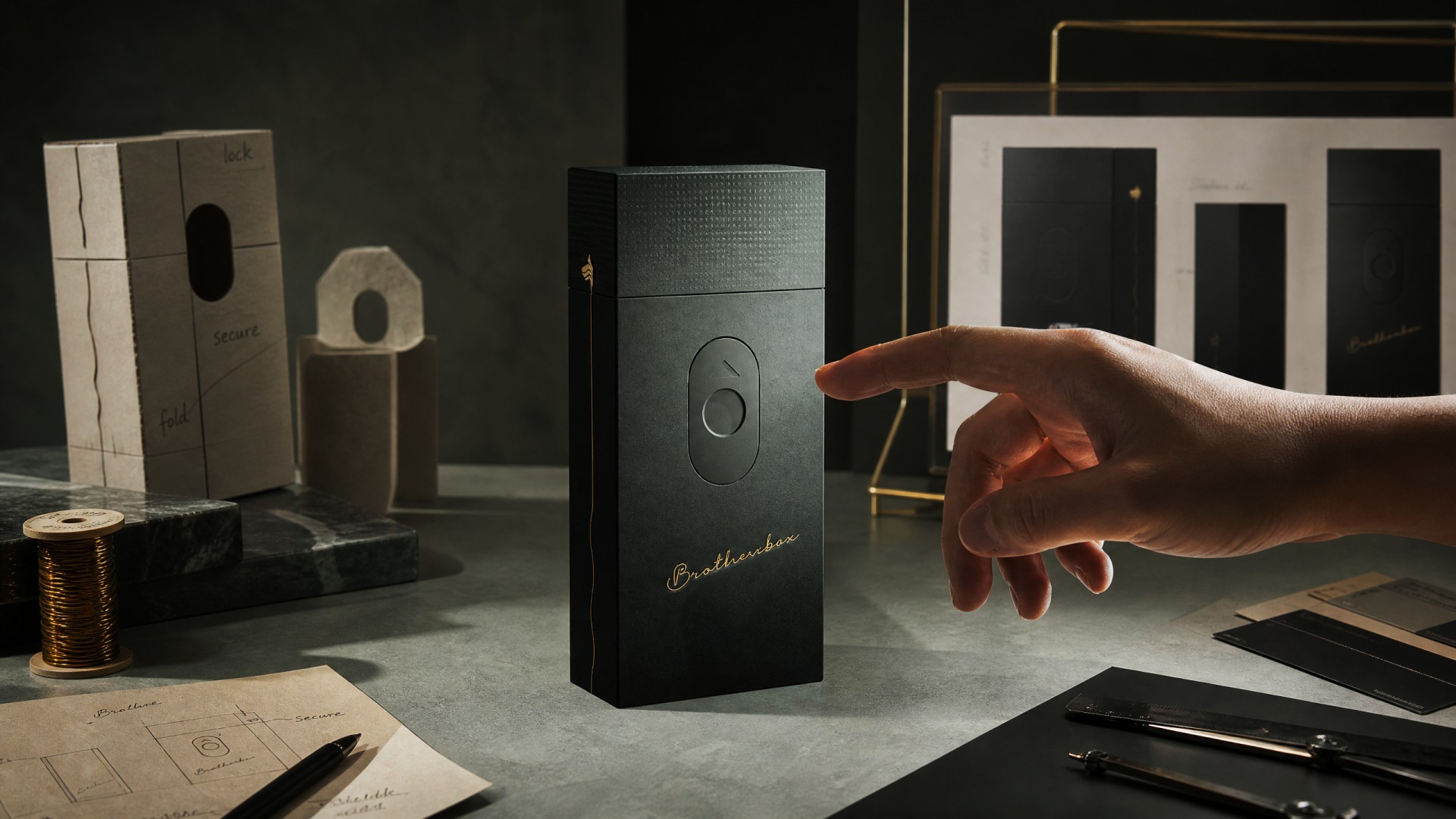
The oval recess serves not only as visual graphic, but also as functional finger position for push‑pull operation. Multiple physical prototypes were iterated to refine opening resistance, stroke and hand‑feel for a smooth user experience.
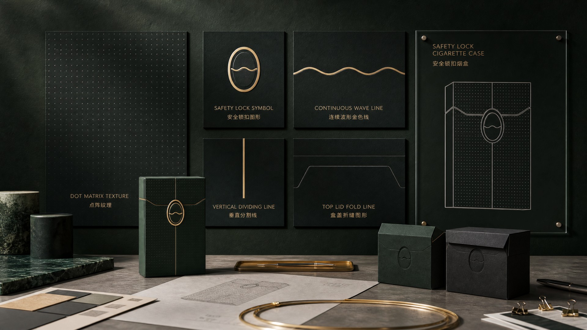
Every graphic element corresponds to physical structure. Dotted‑matrix texture, safety‑lock symbol, continuous golden wave and fold‑line graphics are not merely decorative; they map to texture surface, locking mechanism, side seam and lid folding edges of the actual box.
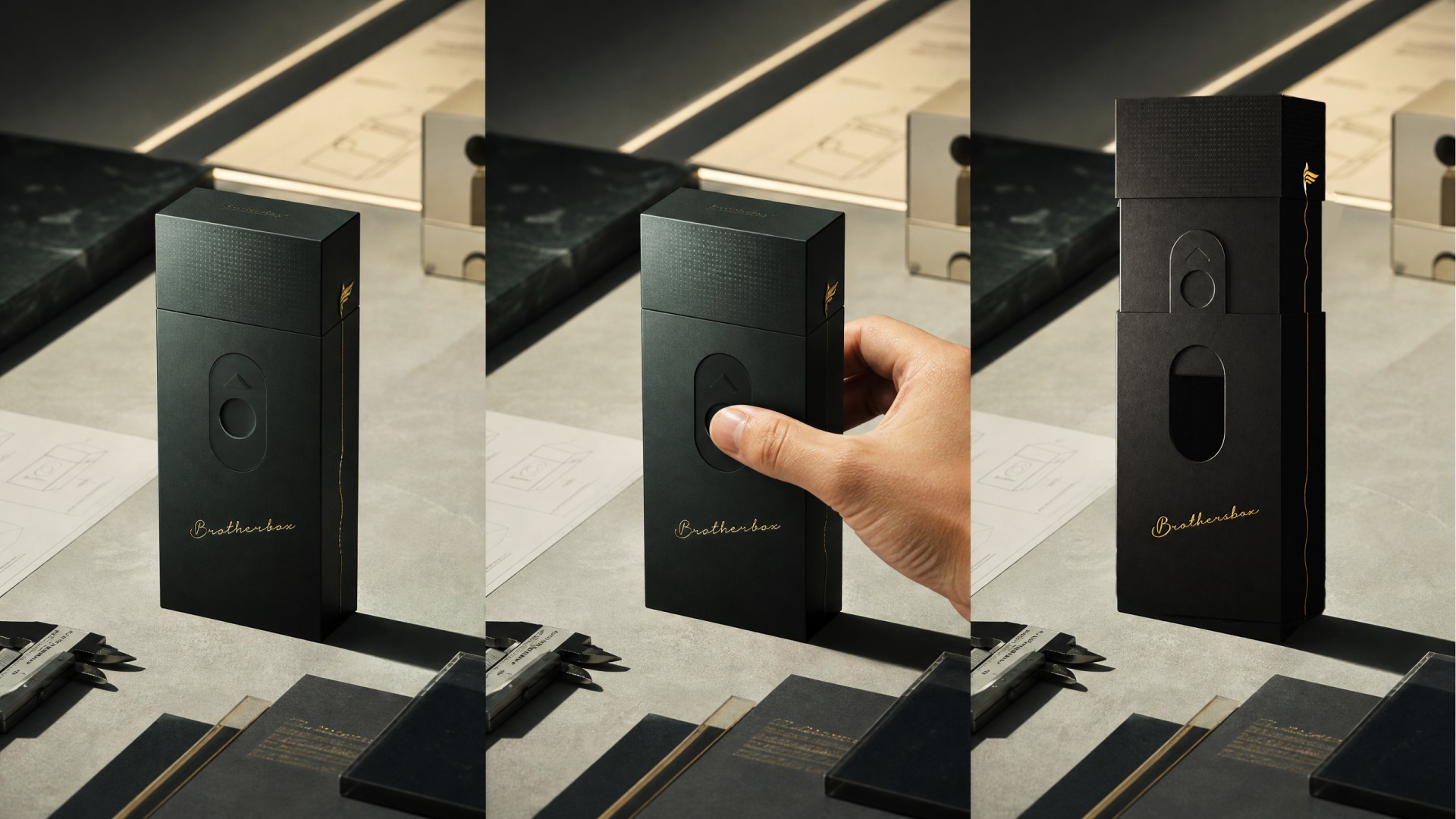
The tri‑frame sequence records the full user operation: static closed state, thumb pressing the oval recess, and inner tray sliding outward. The calibrated sliding resistance delivers deliberate, rhythm‑driven tactile feedback for the whole opening ritual.
08 / Materials & Production
Gold Lines Drifting Across Matte Surfaces
The main body is constructed from high-weight matte-black paper laminated over greyboard, delivering a rigid feel with a suede-like surface texture. The top decorative cap features a micro-embossed dot pattern. The brand emblem, side gold line and Brothersbox script use selective hot-stamping in warm bronze-gold foil, while the oval slider area uses embossing to highlight the functional zone visually and tactilely.
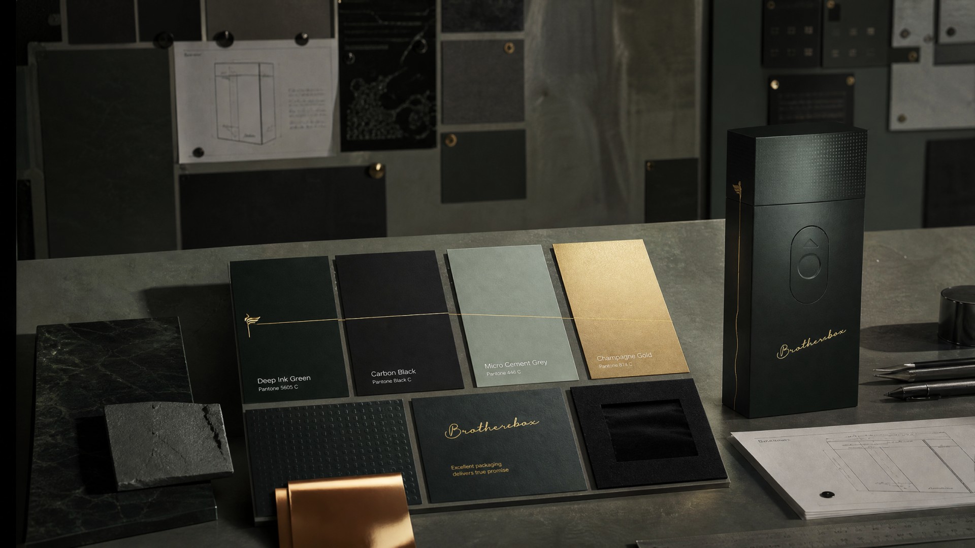
Multiple paper stocks, foil colors and texture swatches were compared. Grey‑board‑backed heavy matte‑black paper delivers rigid box body. Micro‑embossing builds subtle dot texture, while selective hot‑stamping gold brings restrained metallic highlight against dark matte surfaces.
09 / Final Applications
From Palm to Desktop — An Object Always Present
The final product is offered in two colourways: classic matte black and deep forest green. Whether carried in a suit pocket or placed on a desk, in a cigar lounge or at a business meeting, Brothersbox blends into its environment with restrained presence — yet the moment it is picked up, it conveys the user's discerning taste. The accompanying outer box, product card and dust bag continue the same black-and-gold visual language.
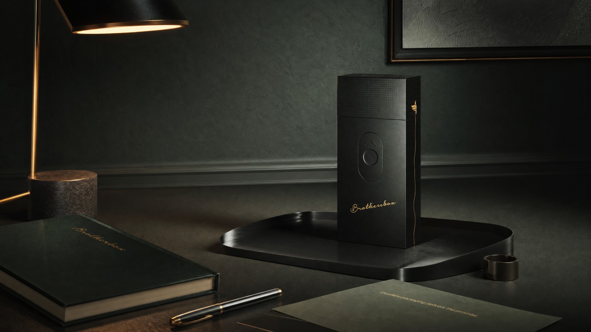
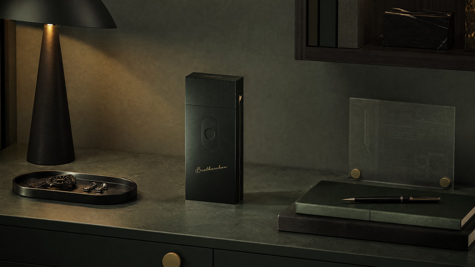
Presented within a sophisticated indoor desktop environment. With restrained silhouette and muted tone, the box fits business study and lounge scenarios. It acts both as functional container and quiet decorative object on daily desk space.