design
Food Girl Pop: Appetite Is a Colour Problem
Ramen, sushi, hot pot and dim sum — a pop-art series about girls who actually eat. Why we painted the food before the faces, and how a bowl of broth became the loudest thing on the page.
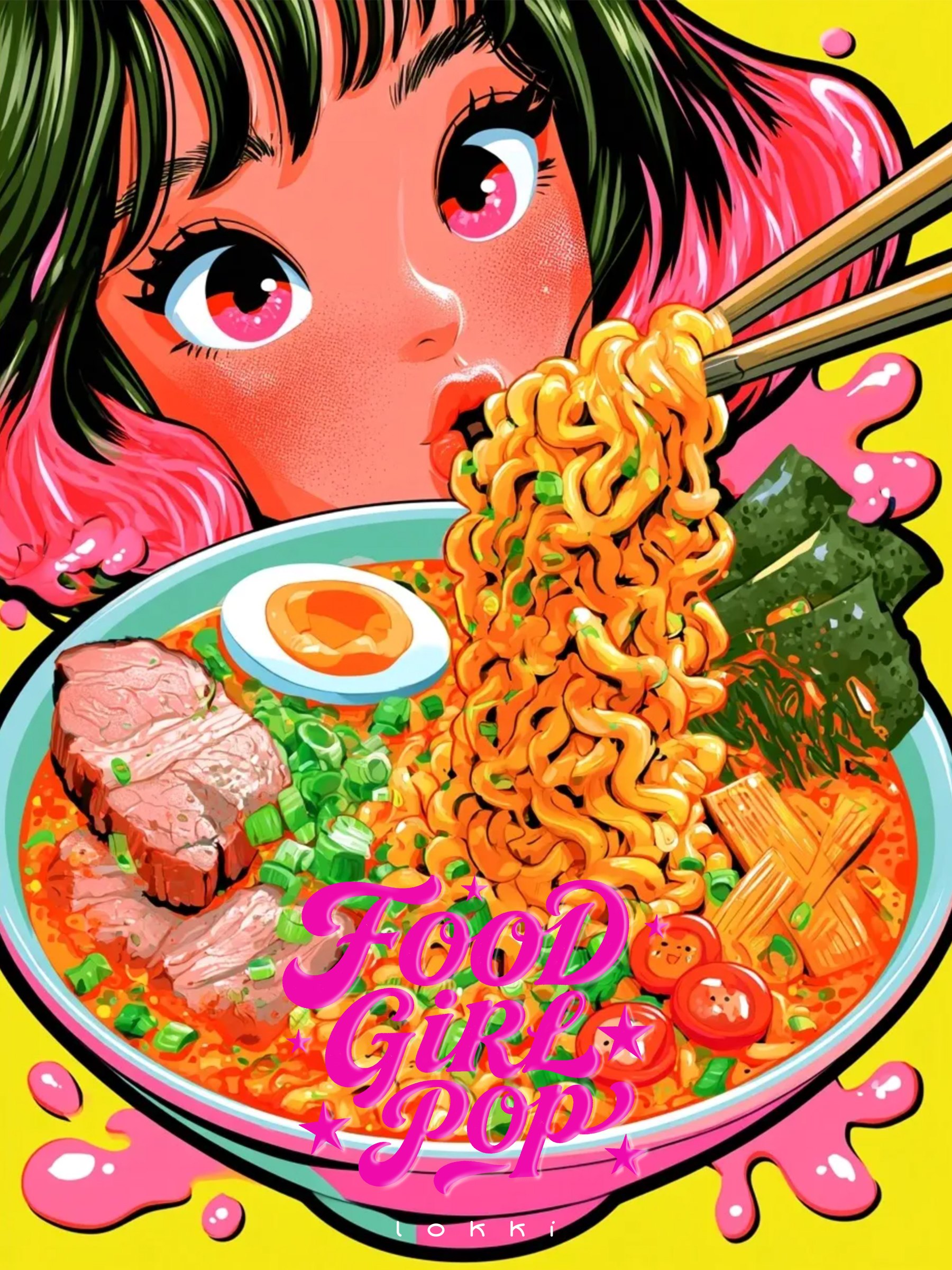
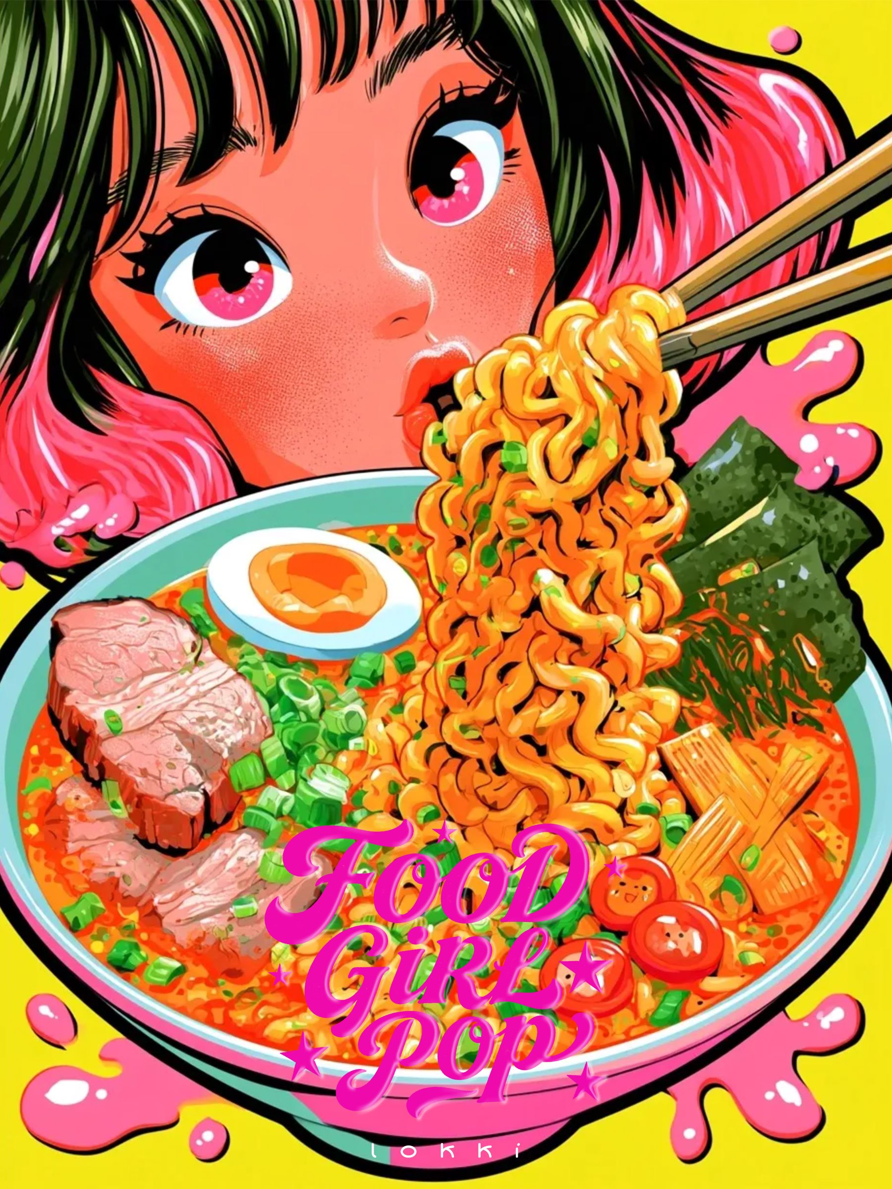
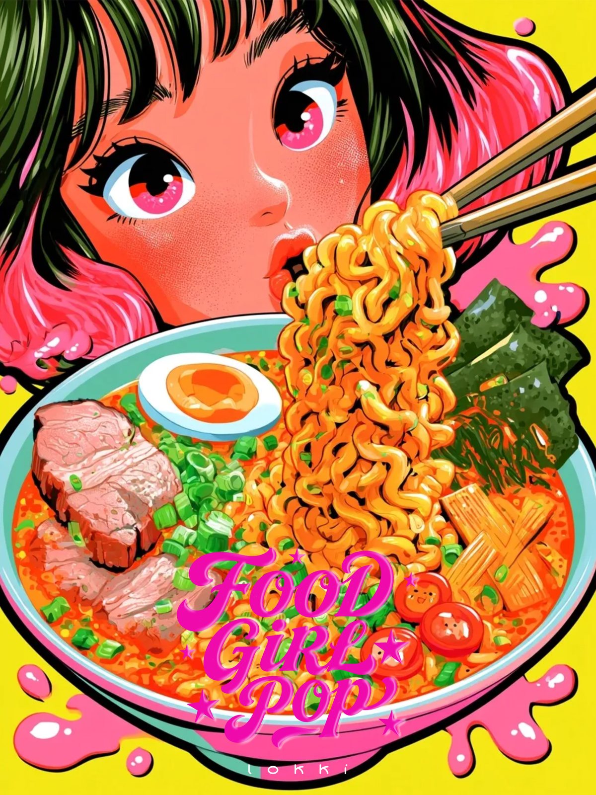
There's a specific red that belongs to a bowl of spicy ramen, and it isn't the red of a tomato or a stop sign. It's hotter and slightly dirty, the colour of chilli oil floating on broth. We spent longer on that red than on the face.
That's the order this series was built in: food first, girl second. Not because the girls don't matter, but because the food is what the picture is actually about.
Paint the food first
Most illustration that involves eating treats the meal as a prop — a bowl in the corner, a chopstick gesture. Here the bowl takes up half the canvas, and the character leans over it the way people actually lean over food they're about to enjoy.
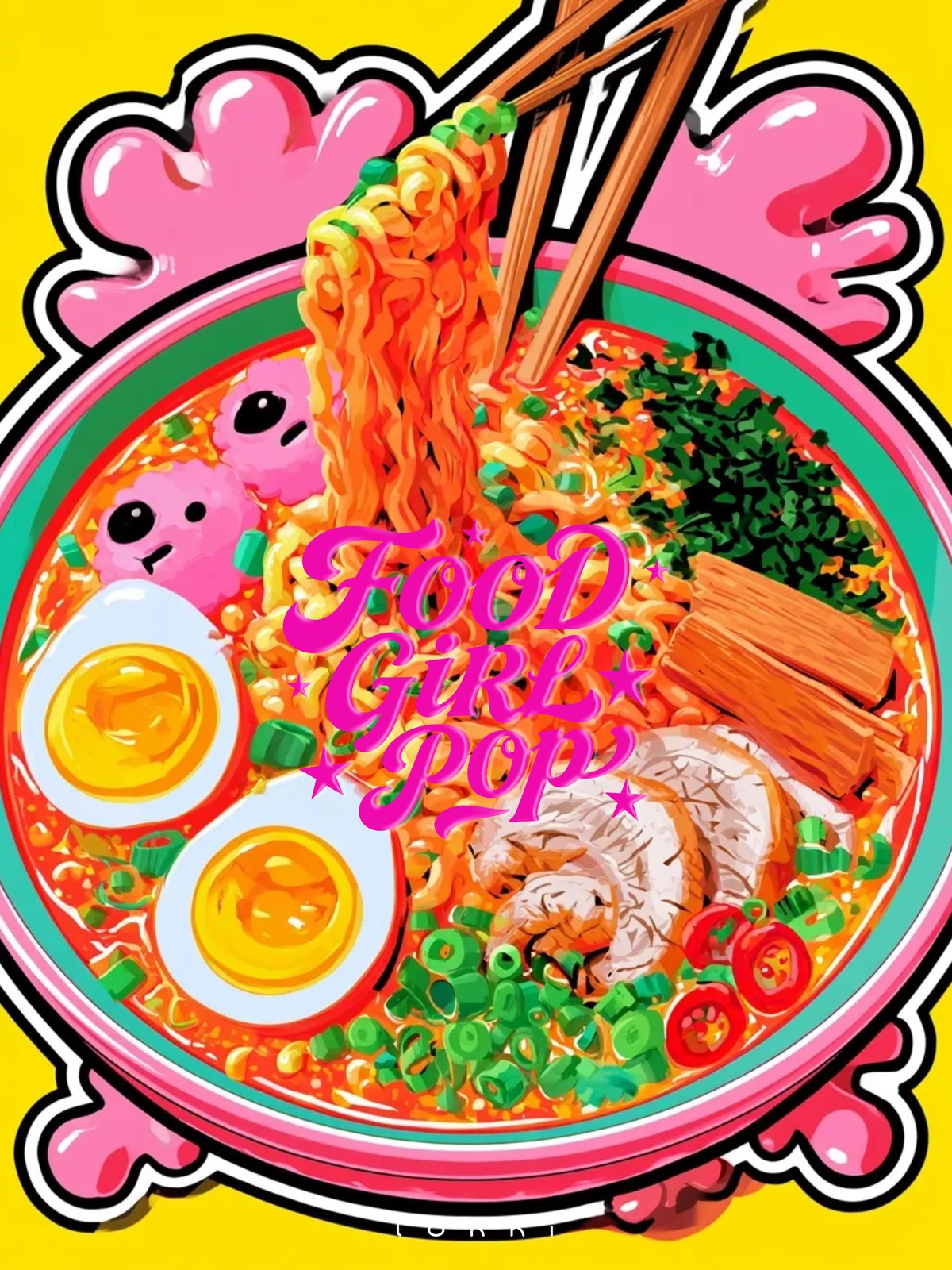
Noodles get individual highlights. Egg yolks get a second, warmer highlight on top of the first. Nori goes matte. It's not realism; it's the same exaggeration a menu photo uses, pushed until it becomes graphic.
The bowl is a stage
Once the food is the subject, the composition solves itself: the bowl becomes a stage and everything else arranges around its rim. Chopsticks become a diagonal. Steam becomes a shape. A sauce splatter becomes a place to put the title.
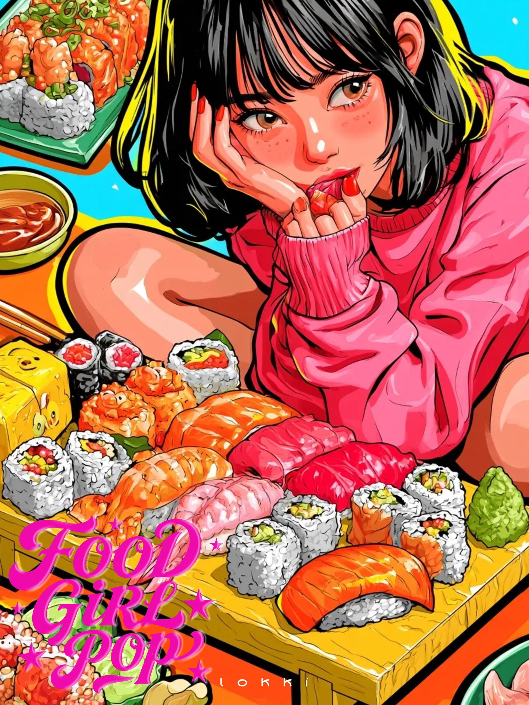
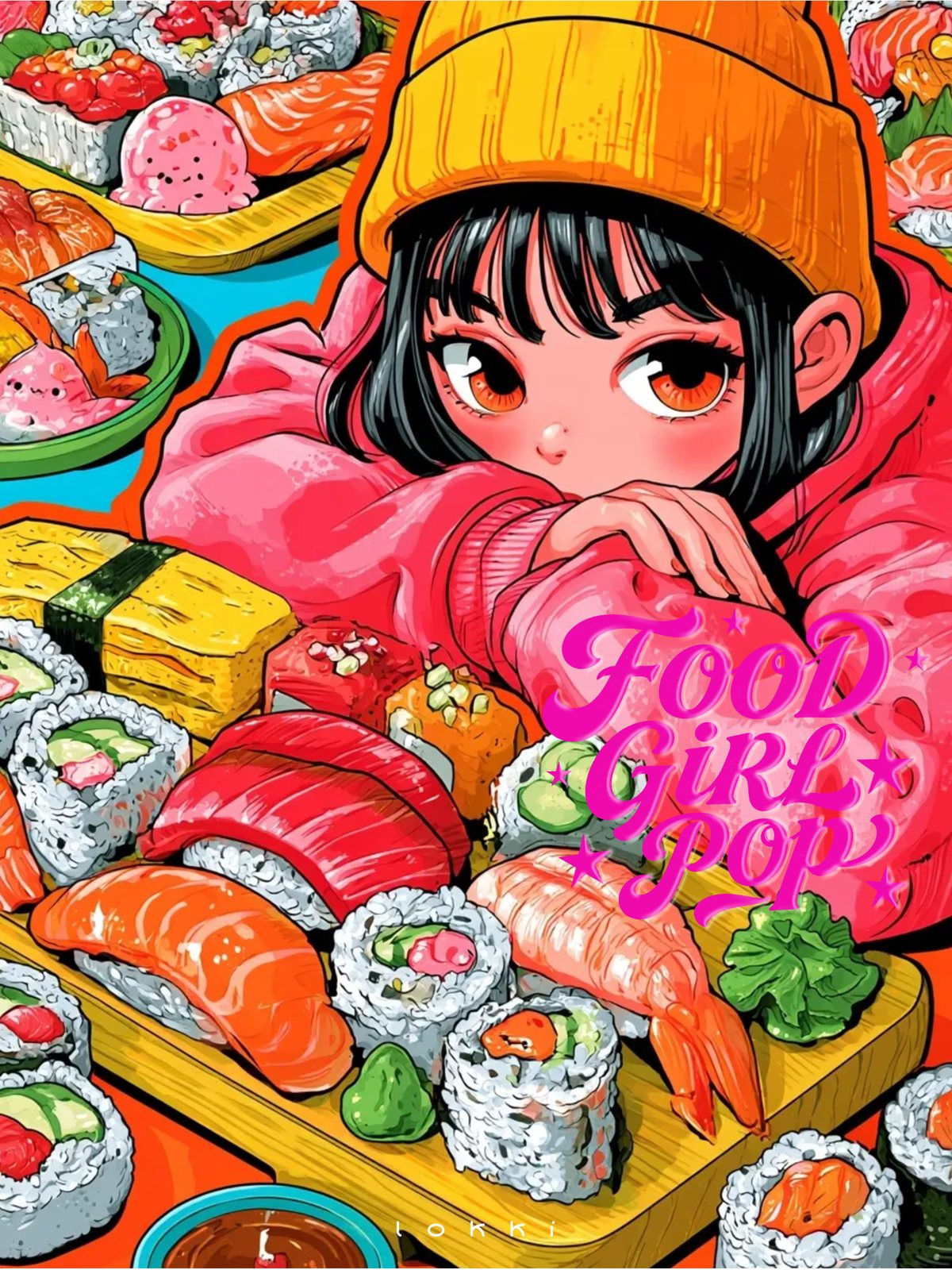
In the sushi pieces the stage gets wider — a wooden board instead of a bowl — and the figure lies down behind it, chin on hand, like someone who has ordered too much and has no regrets about it.
The girls are drawn with the same bold outline as the food, and that's the point: no hierarchy. The person and the shrimp tempura are made of the same material, which is maybe the most honest thing a food illustration can say.
We kept their expressions small. Half-lidded, cheeks full, a little bored. Nobody performs joy in front of a plate. They just eat.
Hunger is not cute. It’s specific. That’s what makes it worth drawing.
Sticker logic
The whole set borrows its surface from 90s stickers and cheap comic printing: heavy black outline, flat fills, a white keyline around the figure so it looks peelable, and a chunky title with a hard shadow.
That keyline is doing more than decoration. It separates the character from a background that is deliberately too busy, the way a sticker separates itself from whatever you stuck it on.
Greedy, not cute
There's a version of this series that would have been adorable and forgettable: big eyes, tiny bites, a heart floating over the chopsticks. We avoided it on purpose. These girls eat like they mean it, and the food is drawn with the same respect you'd give a portrait.
The result reads warmer than the cute version would have. Appetite is a very human thing to admit to.
The colour of steam
Steam is the hardest thing in these pictures, because the obvious answer — white — kills the image. Pure white steam on a saturated background looks like a paper cut-out. So the steam is pink, or peach, or a warm grey that borrows whatever colour is next to it.
The highlights on the broth work the same way. A white dot reads as plastic. A pale orange dot reads as fat, and fat is the thing that makes food look hot.
All twelve pieces are on the Food Girl Pop case page. More sets, including the louder ones, live in AI Lab.