design
Old Dreams of Palace Walls: A Wall That Never Answers
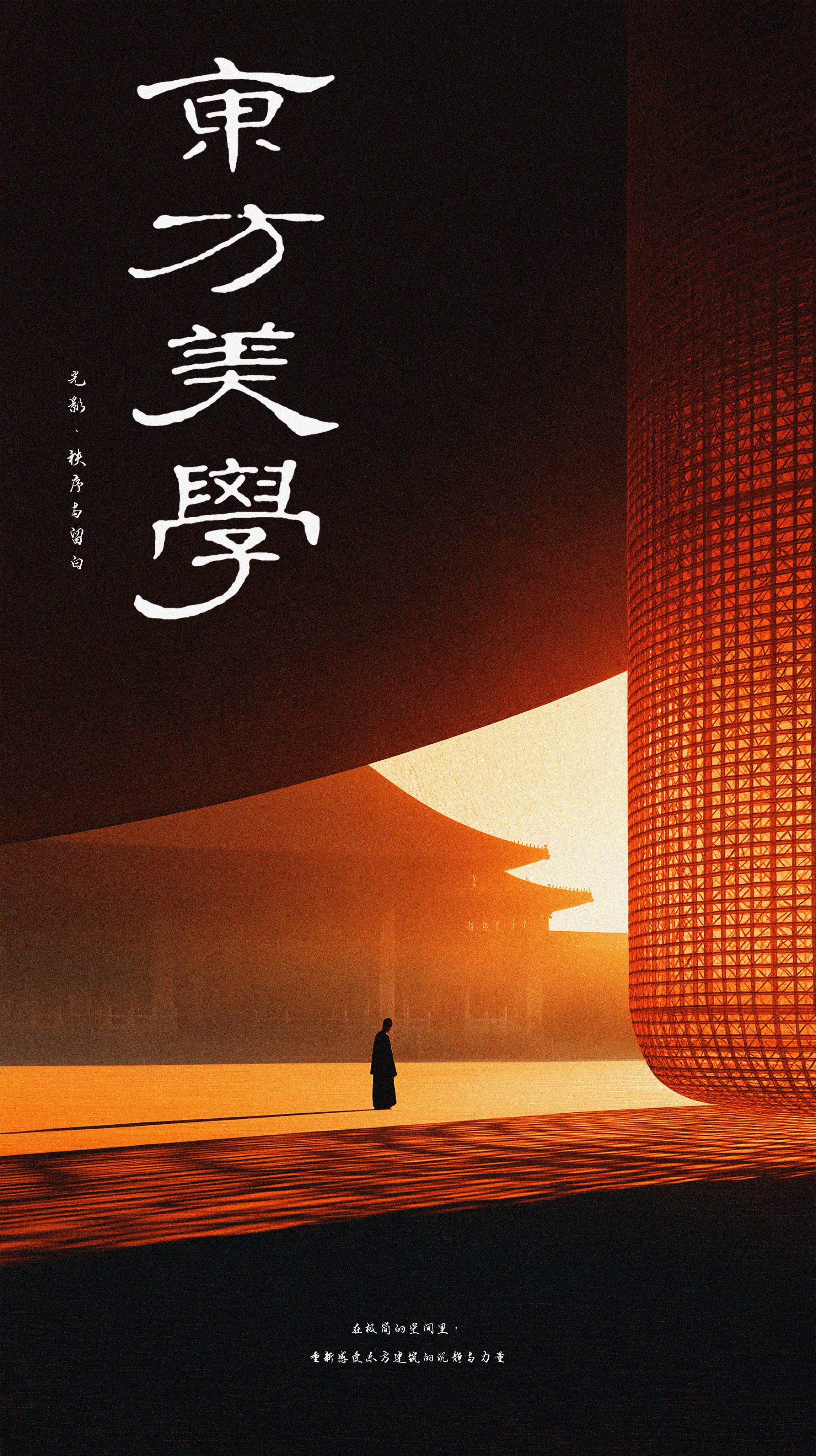
Four posters about a red wall, twenty minutes of orange light, and two people who never turn around. Notes on blank space, small figures and one lantern instead of seven.
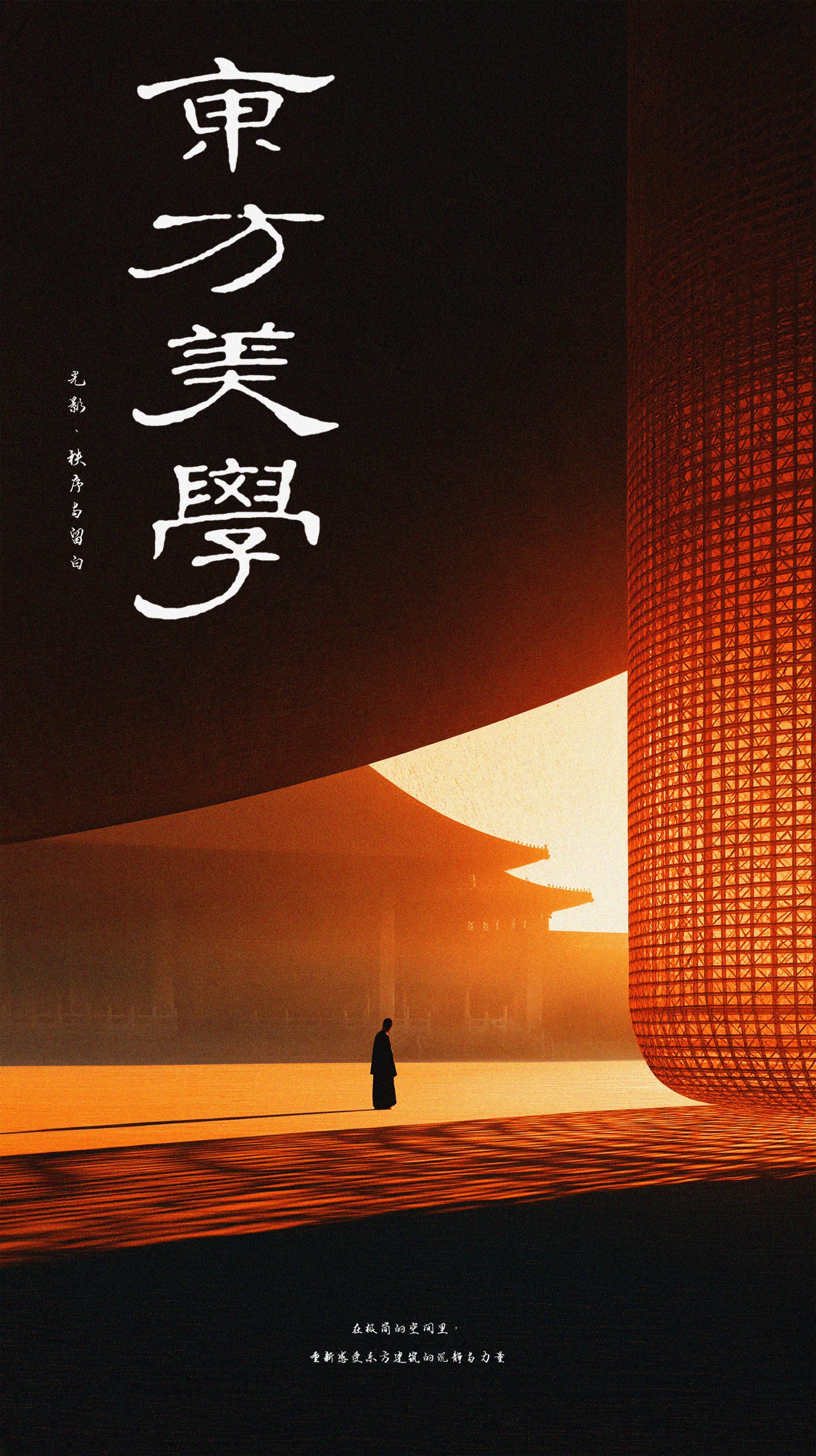
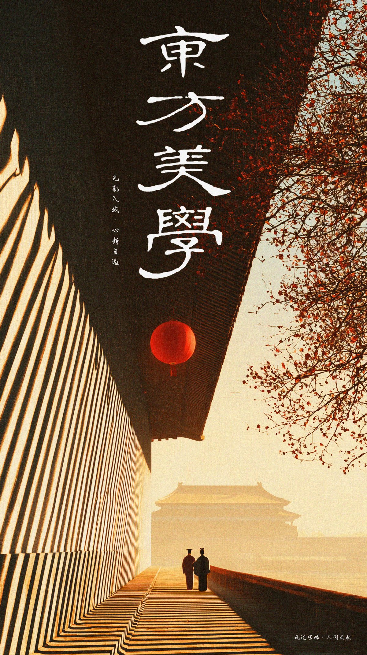
In early autumn I walked along the outer wall of a palace complex at about a quarter to five. The wall was red, the light was orange, and the shadow of the eaves climbed up the wall while I stood there.
I did not take a photograph. I stood for twenty minutes, mostly watching other people walk past the wall, and then went home and tried to draw the twenty minutes instead of the wall.
The wall is the blank space
In Chinese painting, 留白 is not empty. It is the part left for whoever is looking. A wall does that job at architectural scale: it holds nothing except light and a shadow, and you fill it with whatever you brought with you.
That is why the wall takes two thirds of every poster. Not because it is beautiful — because it is empty in the right way.
Twenty minutes of orange
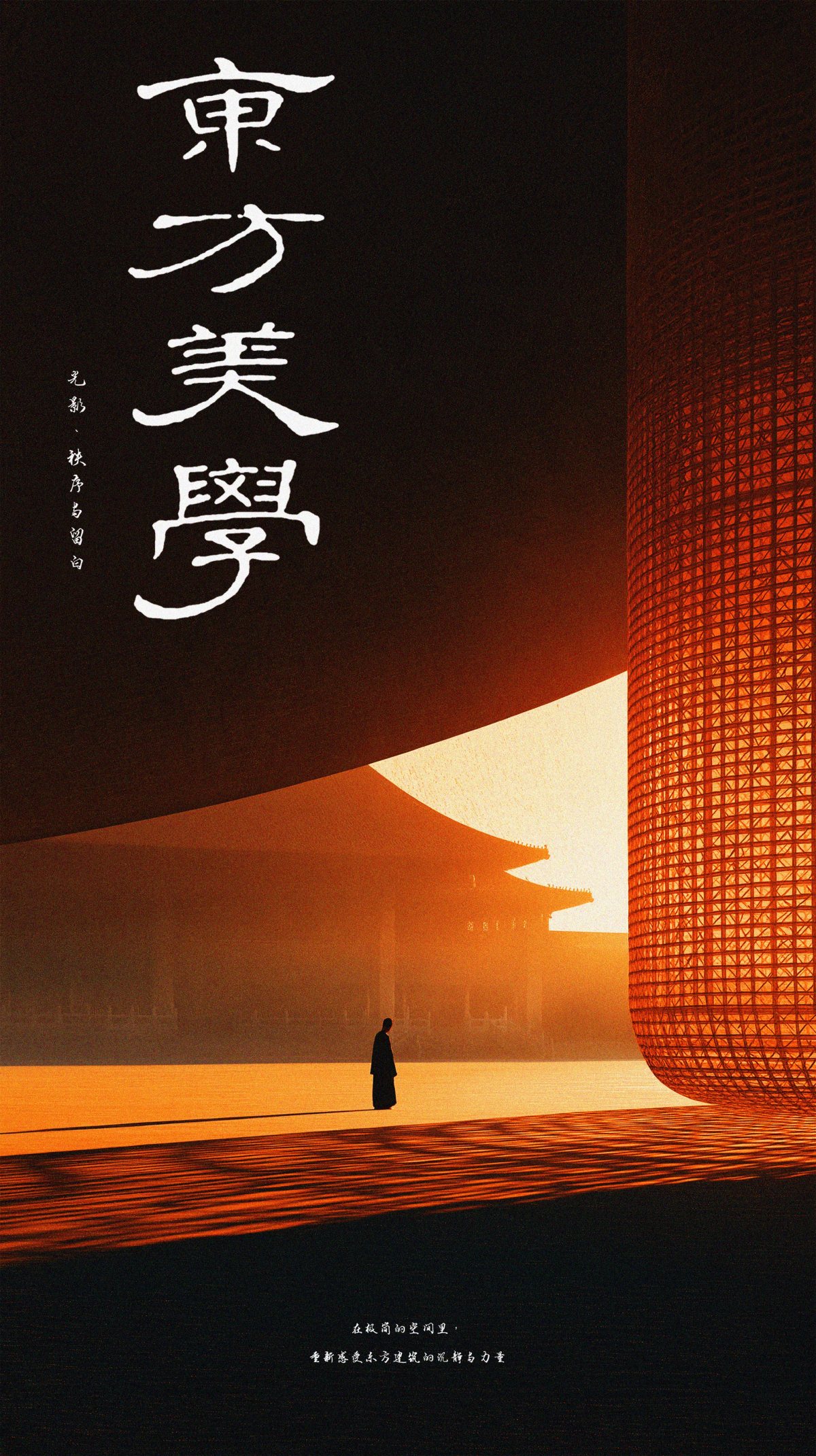
That colour exists between roughly 4:35 and 4:55. Before that it is pink. After, it is grey. We built the palette from five reference frames taken inside the window, and then deleted the frames — once you start matching pixels, the picture stops being a memory and becomes a copy.
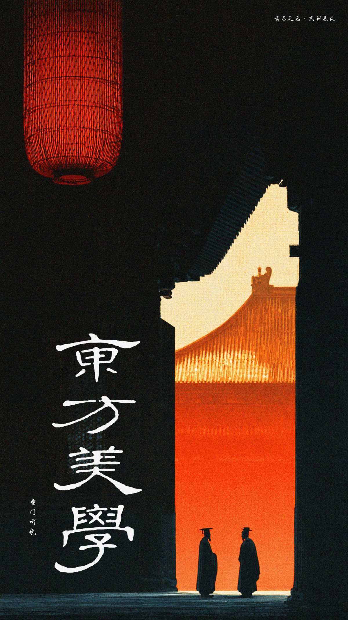
Three of the four posters are lit from the left. The fourth is lit from behind a doorway, and it is the best of the set, because you cannot see the wall at all. Only the piece of it the door allows.
Two people, no faces
Two figures in most of these. They walk away, or stand still, or stand slightly too close to each other. We never turned them around. A face makes it a story about two particular people; no face makes it a story about whoever is standing in front of the poster.
They are about one thirtieth of the frame. Not because we like small people, but because a wall that fills the picture needs somebody to measure it against.
A wall is a good subject because it cannot be improved. You can only wait for the light.
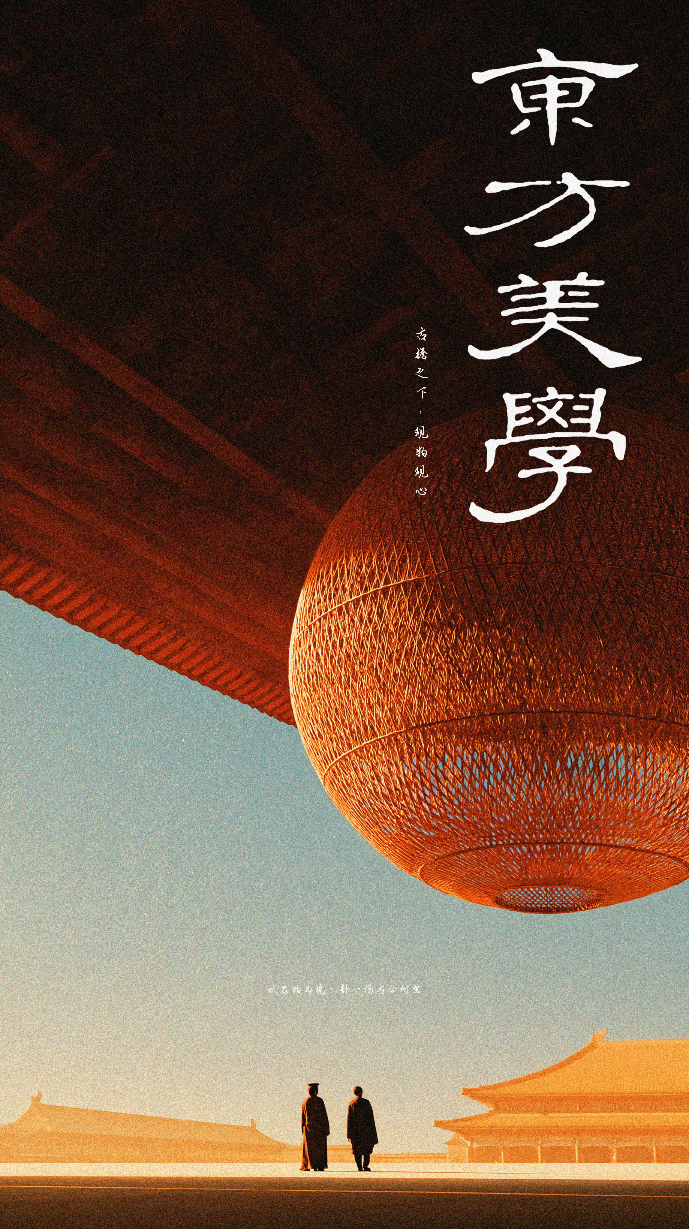
The lantern poster started with the lantern, not the building. A paper lantern at that size stops being an ornament and becomes a light source with a body — it has weight, and the eave has to visibly carry it.
The two figures at the bottom are doing very little. That is deliberate. In a picture with one enormous object, the people are not characters; they are scale marks that happen to be alive.
One lantern, not seven
The first draft had seven lanterns. It looked like a festival, and a festival has no memory in it. We cut back to one per picture, and in the corridor poster we hung it low, at the height of a person’s head, so it reads as a lamp somebody lit rather than as decoration.
Why the title is white
東方美學 is set vertically in white brush, roughly a quarter of the sheet. Black would vanish on a dark wall. White behaves like an inscription left by someone else, which is what a series title should be — not a logo, but a mark someone made before you arrived.
It sits where a colophon sits on a painting, and the hand belongs to a different century than the building. That small mismatch is the whole idea of the series: an old place, looked at by someone who is not from it.
All four posters are on the Old Dreams of Palace Walls case page. The rest of the series is in the archive.