design
Chinese New Year Gift Box Packaging: A Case Built to Travel
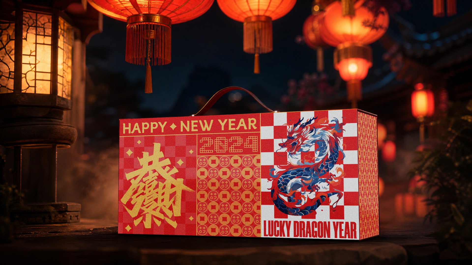
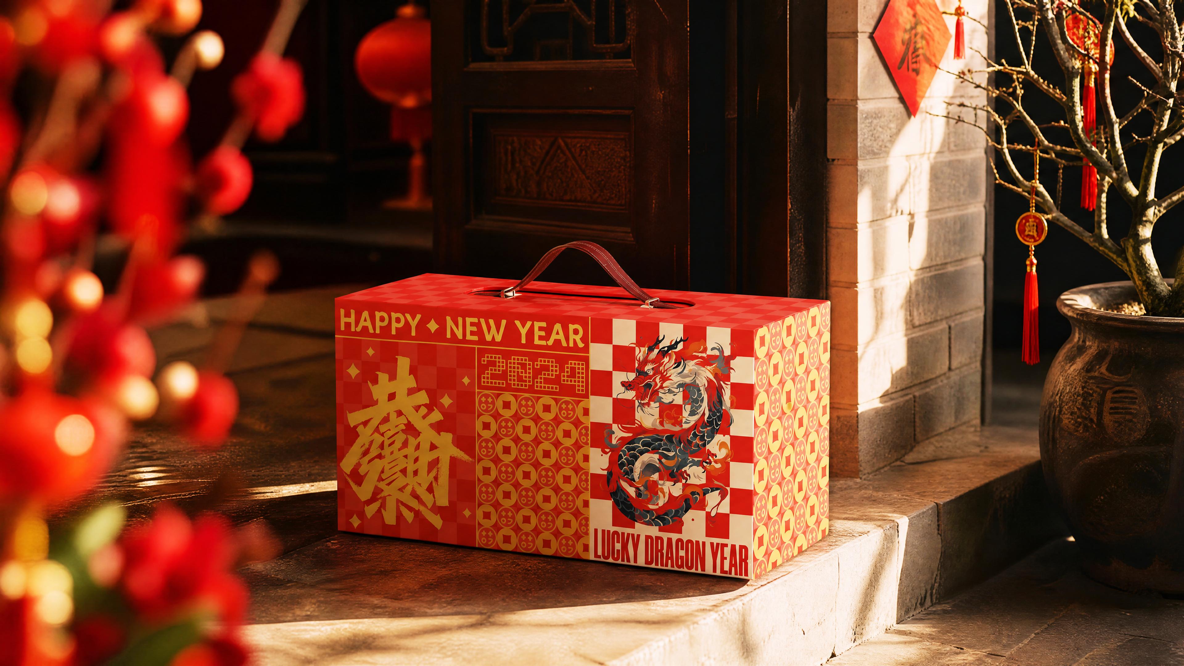
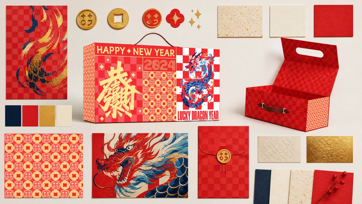
A suitcase-shaped Lunar New Year case with a leather handle, a checkered grid and a blue dragon. The brief was to make festival packaging that is carried, not displayed — and that survives January.
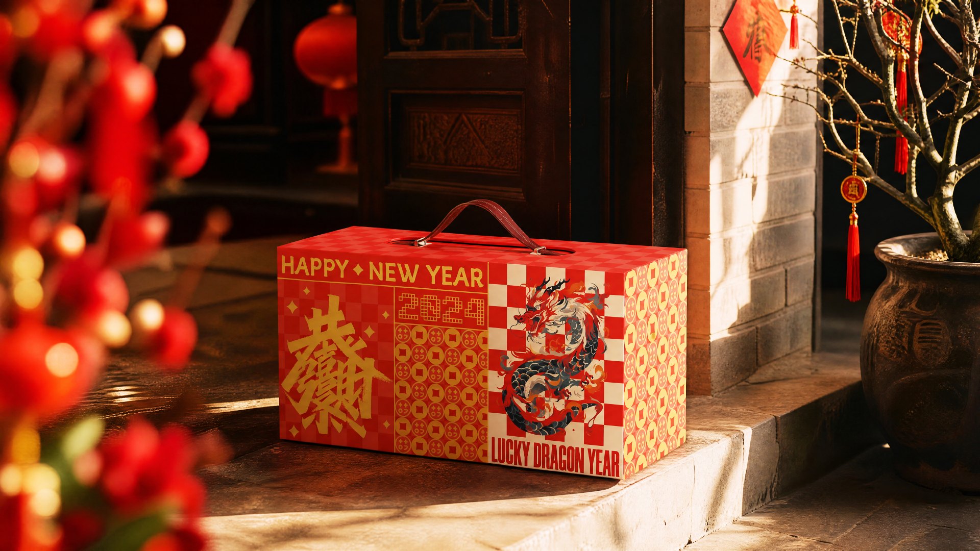
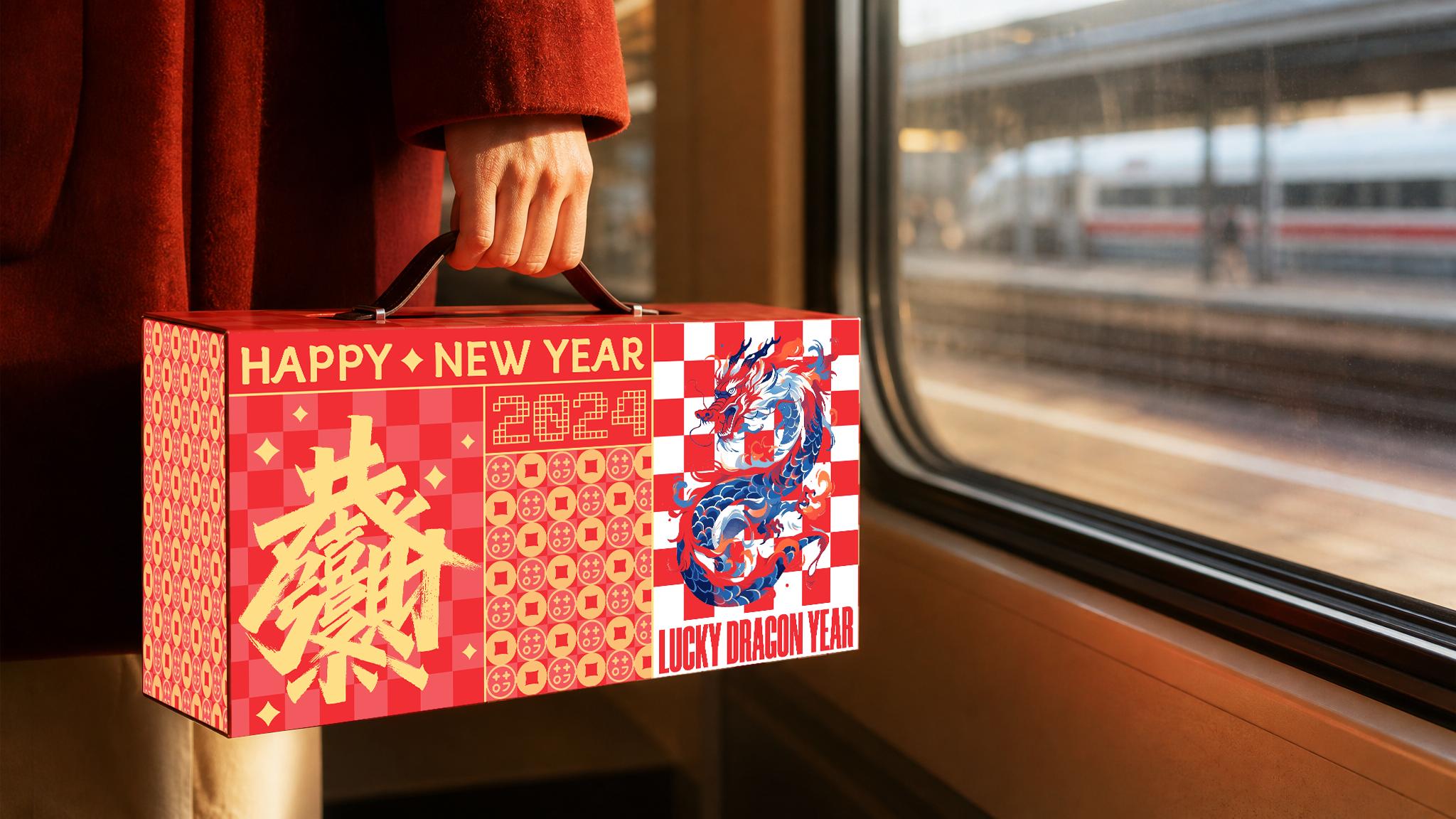
Most gift packaging is designed to be handed over. It spends its life on a table, gets photographed, and is gone by the second week of January. This one was designed to be carried.
The brief was a Lunar New Year case for 2024 — Year of the Dragon — and the decision that shaped everything else came early: it would be a suitcase, not a box. A handle changes an object's social life. It stops being something you present and becomes something you bring.
The problem with dragon year
Every Year of the Dragon brief arrives with the same risk: the animal eats the design. Coins, scales, clouds, calligraphy, red and gold, all stacked until the box looks like shop decoration that happens to hold tea.
So we set one rule before any drawing: the dragon could not be the subject. It had to be a moving element inside a system — the thing that gives the grid speed, not the thing the grid is about.
A grid that could hold a dragon
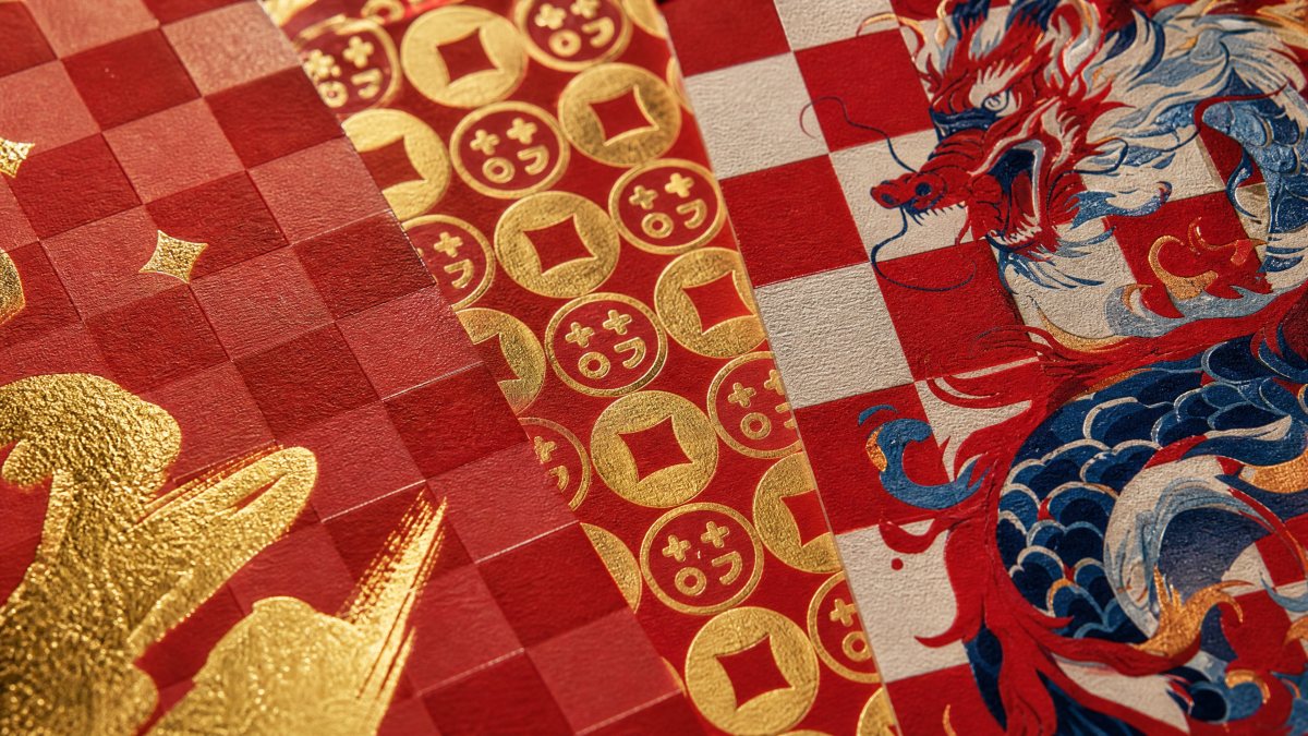
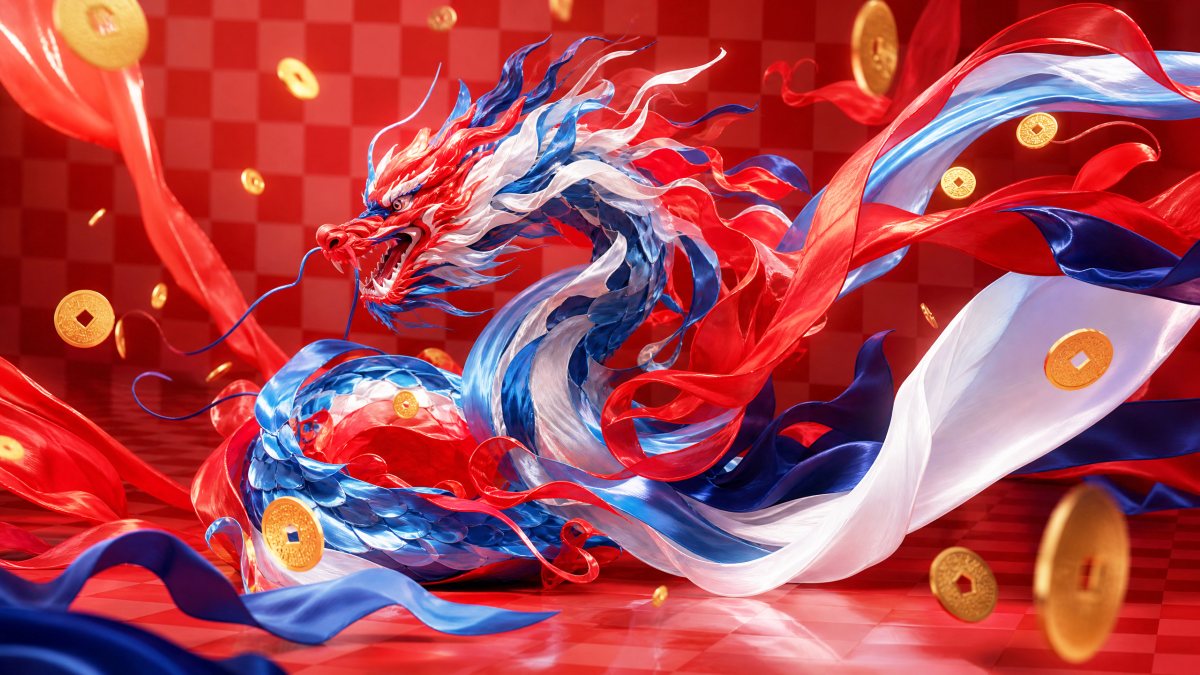
The system has four parts. A red-and-white checkerboard sets rhythm and scale. A coin motif carries the luck, but small and repeated, so it reads as texture before it reads as meaning. Gold type does the shouting. And the dragon — blue, white and red — runs across the grid at an angle and breaks it.
Blue was the decision that made the whole thing work. On a red-and-gold box, a blue dragon is the only element not competing, and it gives the eye somewhere to rest. Everything else could then stay as loud as it wanted.
The handle is the engineering
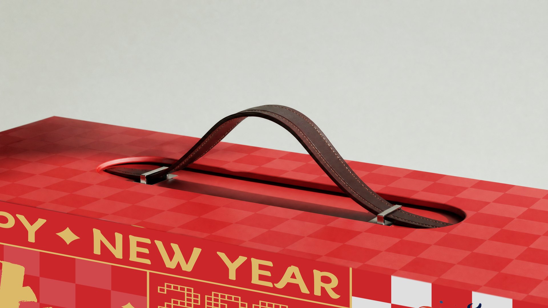
A suitcase handle is a load path. This one carries up to three kilograms — bottles, tins, tea — through a leather strap, two rivets and a 2.5mm reinforced board plate.
The first version used a paper handle wrapped to look like leather. It failed at 2.1 kilograms on the third test, at the fold, which is exactly where we expected it to fail. The second used a real leather strap but bolted it through the lid, leaving two metal heads visible from inside every time the case was opened.
Production rivets into a plate laminated between the lid board and the lining. Nothing shows inside. We tested at three times the intended load, then hung the case from its handle for a week to see whether the board would creep. It moved 0.4mm and stopped.
The handle is also the only part a person touches before they own anything.
It had to feel like leather at the first grip, not like a covered cardboard strip. That is a material budget decision, not a finishing one.
A suitcase has to stand up
Suitcase proportions are less stable than box proportions, and a gift case gets put down on soft things — beds, carpets, chair seats. A box that tips over while someone is untying it has already failed.
We widened the base by 12mm, moved the handle pivot 8mm forward of centre so the case hangs with a slight backward tilt, and used the inner fitment as ballast by putting the heaviest cavity at the bottom. It now stands on a bed, which sounds trivial until you watch someone try to open a gift with one hand.
Inside, the noise stops
Opening it should feel like a change of scene. The exterior is loud — checkerboard, dragon, gold. Inside we dropped the grid to a single band and let the lining carry the colour.
The contrast is the point. The outside is the journey; the inside is the arrival. Every project that tries to be loud on both sides ends up with a box that feels like a poster on both sides.
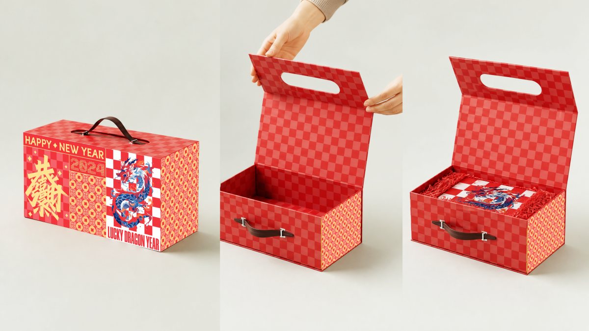
A dragon that sits straight on a grid becomes a logo. It has to be moving to stay an animal.
What survives January
Festival packaging is judged twice: at the moment of giving, and in the second week of January, when somebody decides whether to keep it. Most studios only design honestly for the first.
This case survives because it is still useful. It holds things, it has a handle, it stacks. Several clients have told us they keep documents in it. That is not a design ambition, but it is a better outcome than the bin.
What we would change: prototype the handle before the artwork. We spent three weeks on illustration, then discovered the load path wanted a different lid construction, which moved every panel by four millimetres. On a project where structure tells the story, structure goes first — the same lesson we took from the Brothersbox drawer, where a millimetre decided whether the object felt expensive.
One more thing about the grid
The checkerboard is doing commercial work that is easy to miss. It scales. The same module prints on a 40mm label, a 300mm panel and a web banner without redrawing anything, which is why the identity could extend across the carton, the card and the digital campaign with one artwork file.
That is the part of festival packaging that rarely gets discussed and always gets paid for: whether the idea survives being applied by somebody else, at a different size, six weeks later. It sits with the rest of our packaging work as the clearest example we have of a system that was built to be extended rather than admired.