design
Premium Cigarette Case Packaging: The Second It Is Offered
Brothersbox is a matte black case with one gold line and a 1.2mm thumb recess. A study in tolerance budgets, foil temperature, and the difference between an object that is shown and one that is carried.
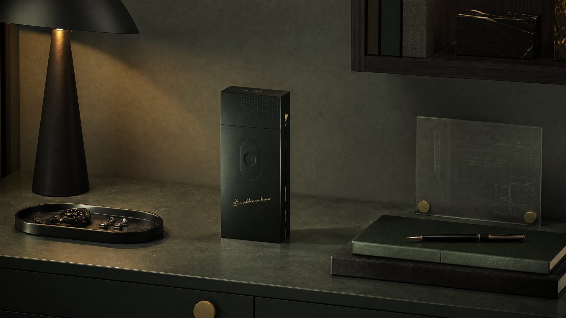
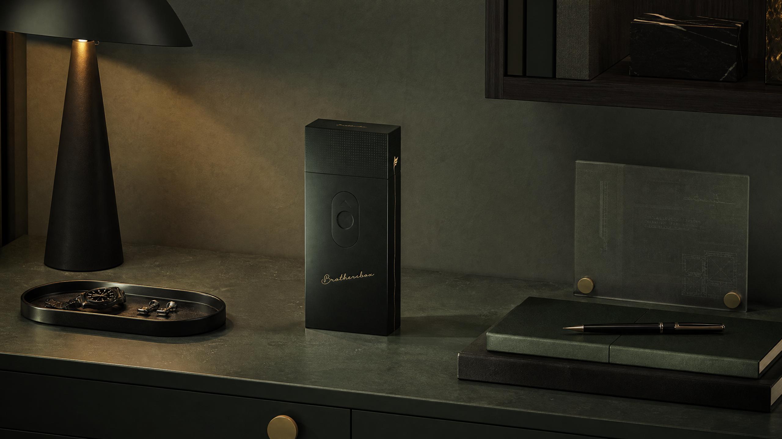
There is a specific moment this object was designed for, and it is not the moment of purchase. It is the moment a case is set down on a table in front of three other people, and then opened.
Brothersbox is a premium cigarette case built for that second. The brief was to give a small, ordinary object social weight without turning it into a display piece — which in this category is the entire difficulty, and the reason most of the market has quietly stopped being designed.
A category that gave up
The functional end of the market is tins with a logo. The decorative end is engraved metal that looks like it belonged to somebody's grandfather, or to nobody in particular. Neither is something a thirty-five-year-old puts on a table in a meeting.
So the gap was not aesthetic. It was behavioural. Whatever we made had to be worth taking out, and worth putting back — two actions that most packaging never has to survive.
One line, drawn twice
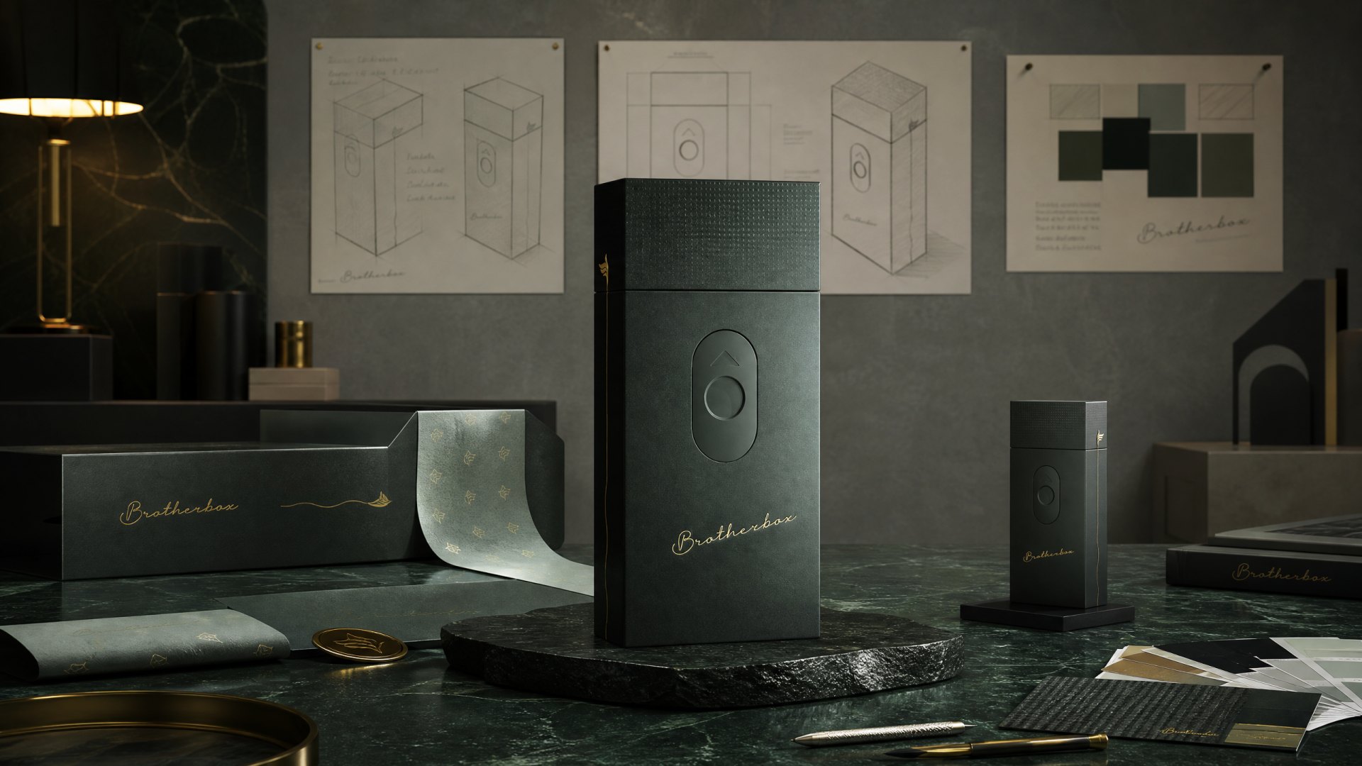
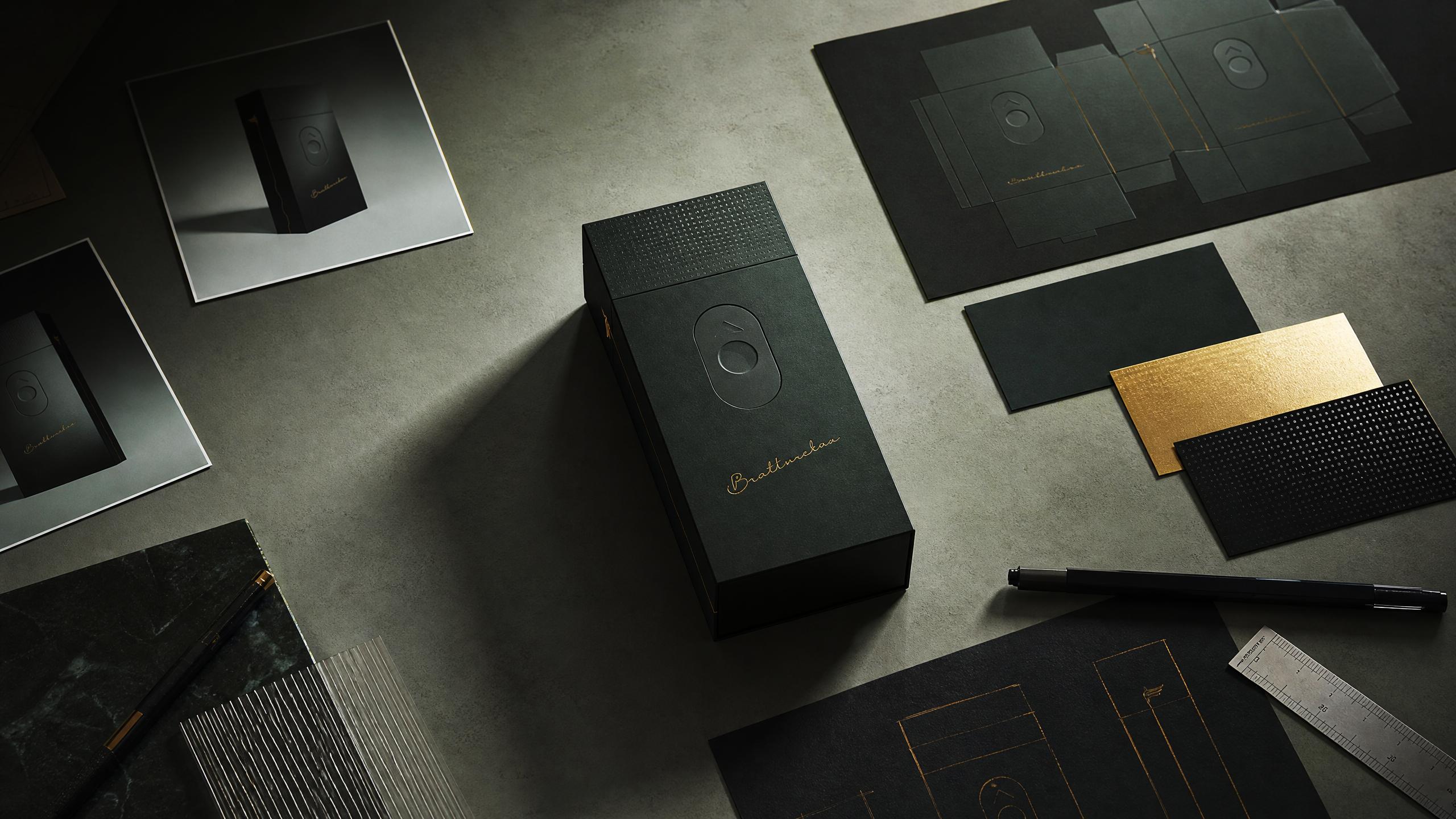
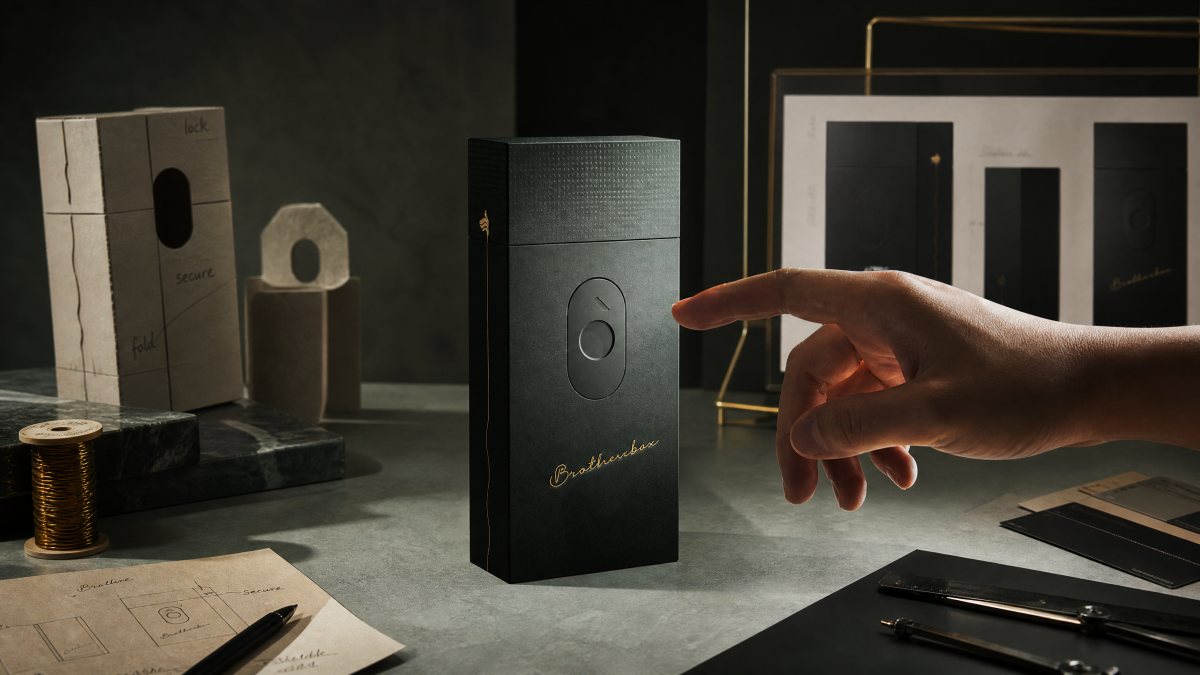
The concept came from a single observation about the way men describe friendship: rarely in words, usually in continuity. We drew that as one gold line. It begins at the leaf mark on the top face, follows the contour of the case down the side, and ends at the base. It is decoration, and it is also a diagram of a relationship — continuous, quiet, unbroken.
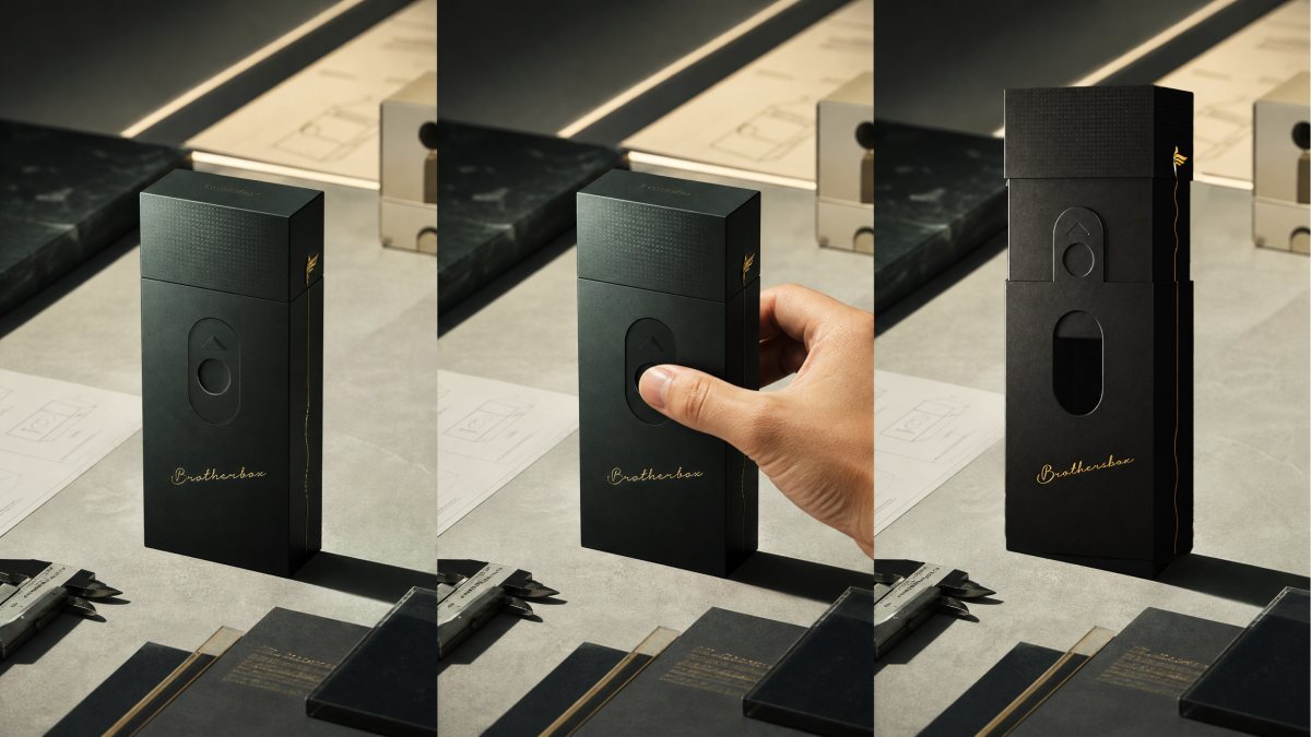
The oval recess on the front is the switch for that line. Push, and the drawer releases. The gesture is deliberately small: nothing about the object asks to be performed.
We tested the line at three weights before committing. At 0.4mm it disappeared under the fold; at 0.8mm it became a racing stripe.
The 0.6mm version survived every light condition we tried, including the worst one — a restaurant at night.
The mechanism was the hard part
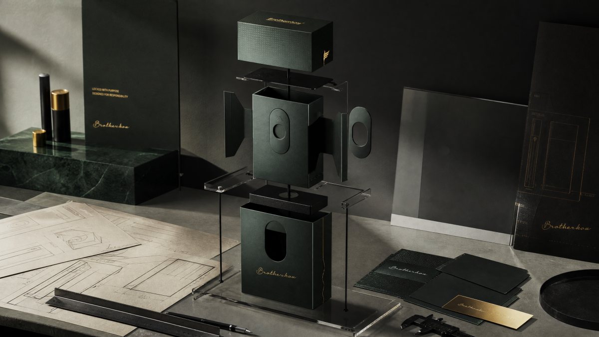
A two-layer drawer sounds simple — outer sleeve, inner tray, slide — and in the hand it is not. Our first prototype was too loose: the tray travelled about two millimetres before it caught, and that reads as cheap long before anyone can explain why. The second was too tight and needed two hands, which defeats the entire gesture.
The fix was not a new mechanism. It was a tolerance budget. We mapped every layer: 0.6mm board, 0.15mm wrap allowance, 0.4mm clearance per rail. Then we moved the friction out of the paper and into a felt shim on one rail only — asymmetric damping, so the tray tracks straight instead of wobbling side to side.
The oval had its own number. At 0.8mm deep, a thumb slides off. At two millimetres it becomes a hole and the front face looks punched. At 1.2mm, with a 0.3mm emboss around the rim, it catches the thumb and reads as a button.
Matte black is not one colour
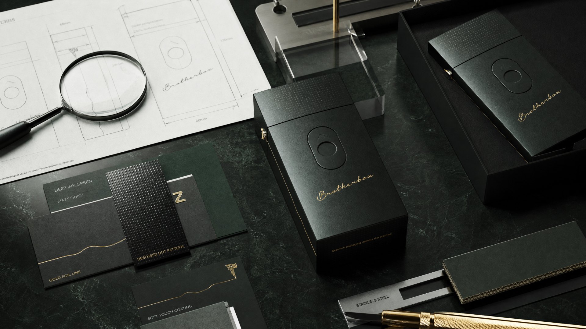
Every supplier's matte black is a different temperature. Some go blue, some go brown, and the difference only appears when two units sit next to each other in daylight. We locked the stock and the foil together and refused substitutions: a high-gsm matte black sheet wrapped over greyboard, with the leaf mark, the side line and the wordmark all in a single foil pass at one temperature.
The dot matrix on the top plate is micro-embossed rather than printed. Print wears at the corners within a month of pocket carry. An emboss reads as texture instead of ink, and it does not care how many times the case goes in and out of a jacket.
Where the cost actually sat
Premium positioning usually gets argued at the finish, and it is almost always decided earlier. Here the two expensive items were the die for the oval emboss and the felt shim, and neither is visible from more than thirty centimetres away.
What we cut instead: the magnet in the outer carton, a second foil colour, and the inner printing on the lid. None of those three would have been noticed by the person the case was designed for. All three would have pushed unit cost past the point where it could enter a gift-with-purchase programme — which was half the reason the project existed.
The visible decisions get approved in a meeting. The invisible ones decide whether the thing is kept.
The colourway that turned out to matter
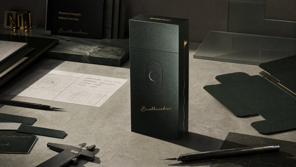
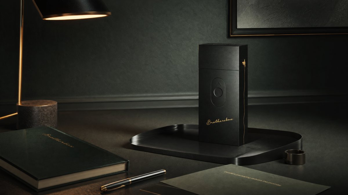
The second finish — a deep green — started as a request for range and ended up the more interesting object. On green the gold reads warmer, and the case stops looking like a product and starts looking like a personal item, closer to a lighter or a watch than to packaging.
Both finishes share the same die, the same foil and the same interior, which is why the range could be added without a second tooling budget. That is a commercial decision as much as a design one: a family that costs almost nothing to extend is a family that survives the second season. It sits with the rest of our packaging work, next to a project that asked the opposite question — the fragrance box, where luxury had to be announced rather than withheld.
The state nobody photographs
A case like this is judged in three states: closed on a table, open in a hand, and empty in a drawer six months later. We designed for the first two and only tested the third late, which is a mistake we would not repeat.
What we found was small and useful. The flock scuffs at the corners where the tray meets the sleeve, because that is where the two parts rub every single time. We added a one-millimetre relief at each corner. Nobody will ever see it. It is the reason the object still feels new after a year.
That is the discipline this category asks for. Half the work is a line that photographs well. The other half is a millimetre nobody will ever notice, and which decides whether the thing stays in someone's pocket.